We are sure that there are times when you crave some good tangy Thai flavours and also miss the vibrant experience of street life in Thailand. Naming from the famous street of Bangkok, Khao San is such a place where you can meet both. Founded by four friends – Bushra Haque Sarah, Syed Sameem Shahriyar, Taposh Ghosh, and Mustafid Raiyan Khan—Khao San is more than just a dining spot; it’s a passion project.

After gaining popularity in Dhanmondi, Khao San has now made its mark in the heart of Gulshan. Despite being open for only a few months, the restaurant has already captured the hearts of diners with its delectable taste and unique interior. With the air infused with tantalising Thai flavours and the atmosphere adorned with bold hues with a pinch of earthy colours, the restaurant interior pays an ode to its famous Thai street namesake, Khao San Road. As guests step into this new branch, they might subconsciously reminisce about the interior of Dhanmondi and immediately be enveloped in a newer enchantment.
The restaurant not only draws its name from the famous road but also matches the vibes of the lively and bustling area renowned for its vibrant nightlife and dynamic energy. Through careful design interventions, the restaurant’s interior captures this spirited ambiance, blending the bustling vibe of Khao San Road with a serene touch of nature. We designed Khao San Gulshan with the Dhanmondi branch in mind. We tried to maintain a similar essence,” said Sheefa. Like the debut branch, the interior has been done by Rahnuma Tasnim Sheefa, the principal architect of Parti.Studio. Once you’re inside Khao San Gulshan, you will consciously notice the wooden motifs on the main door, inspired by the lotus flowers of Thailand. The same motif is also reflected in the door knobs of washrooms and a partition door, creating a cohesive design throughout the space. The designer has carefully merged the wooden motifs with the glass, creating a screening that added a modern touch to the usual traditional design element.
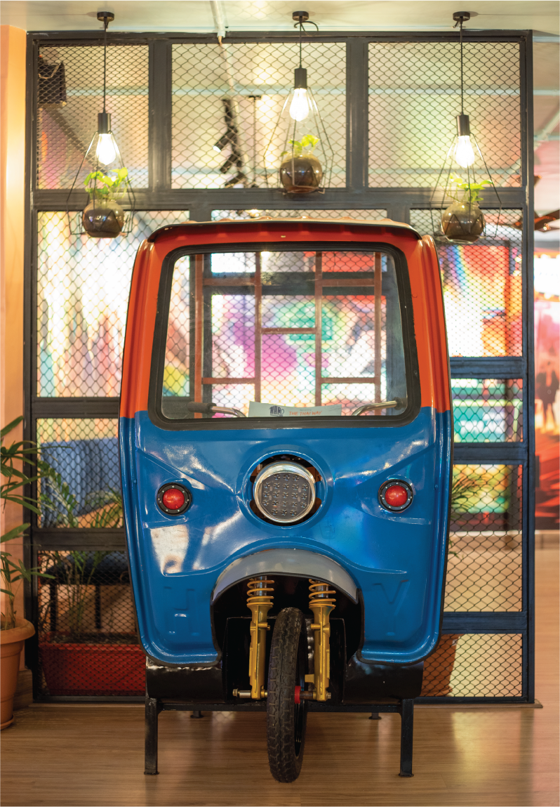

Upon entering the space, you will be greeted by a vibrant, real tuk-tuk. The dining area is mostly an open plan divided into several zones that are connected visually yet spaced out with mesh dividers and plants. There’s also a private room for larger groups. One of the seating zones features an elevated floor space where you will discover a wall composed of a wooden window with a stunning mural painted inside and designed beside a rustic doorframe.
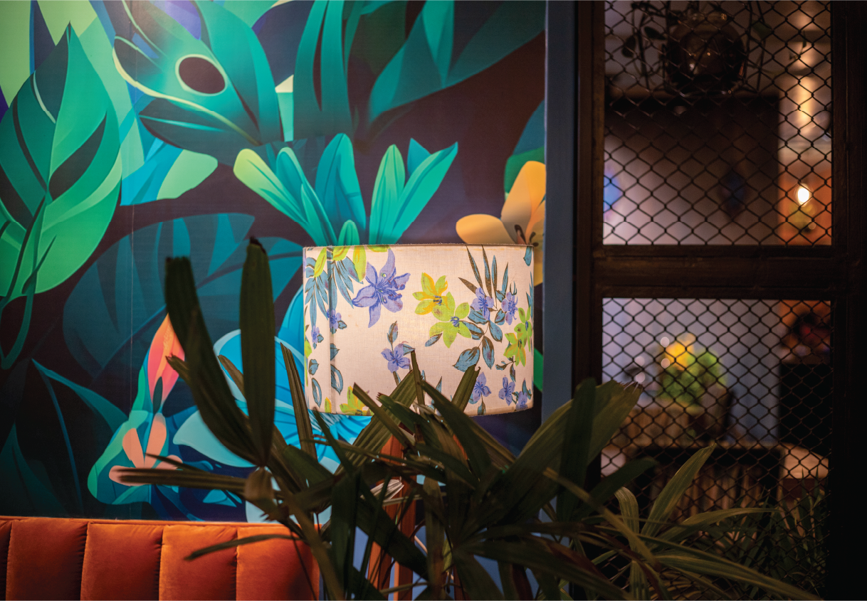
As the architect described, the entire space is very “instagrammable.”. You will find corners or elements to take dope pictures. With splashes of vibrant hues, warm tones, and moody ambient lighting, each nook and cranny has been designed to capture the eyes of the visitors, inviting them to take a closer look and explore the decor. The restaurant design mimics the scenic nature and happening city life of Thailand, interpreted to fit into the theme. Through closer inspection, you will be able to decipher that the city-influenced part of the restaurant has warm tones of orange, red, and yellow. On the other side, the nature part has an upper hand with cool tones of blues and greens.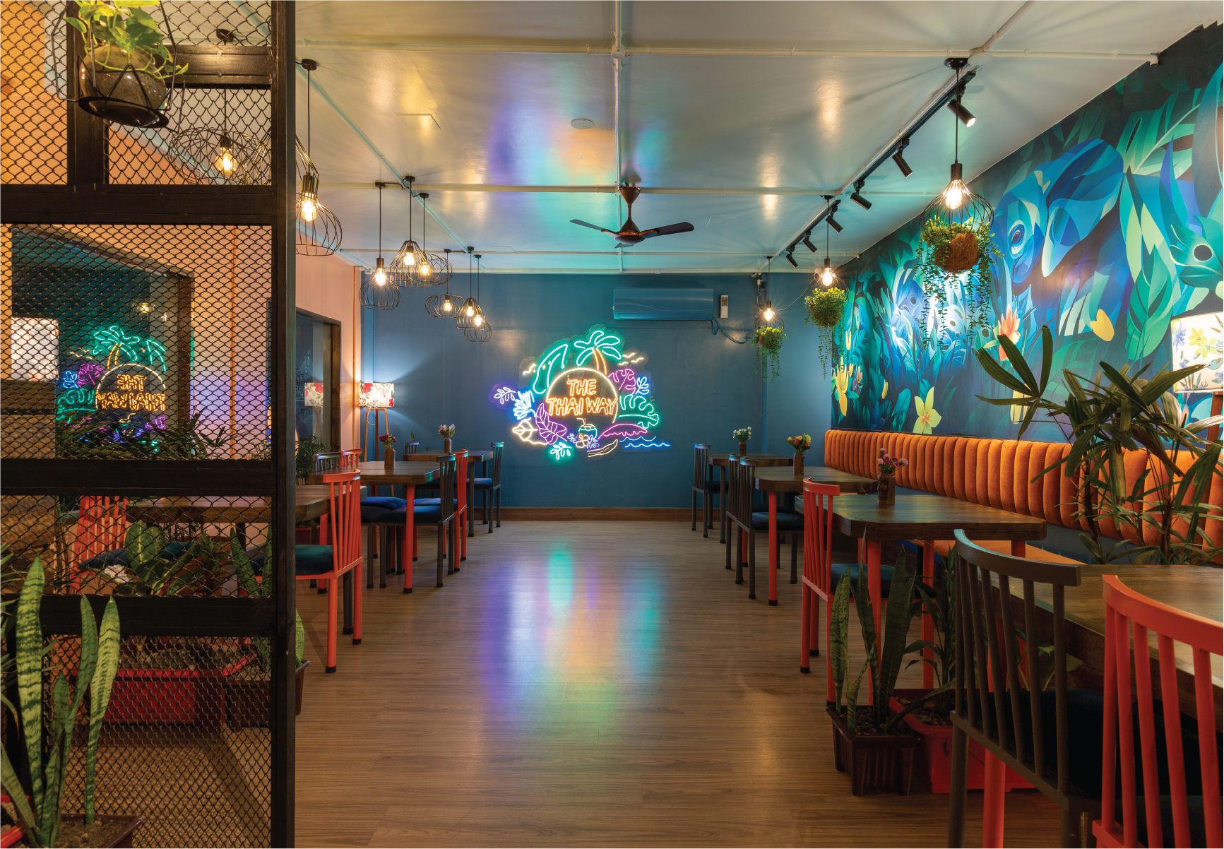
“Throughout the space, we introduced natural plants to keep the nature found. On a wall, you will find a huge illustration with an elephant, which is a vital character from the branding. The story goes like the elephant, after exploring the city, is moving from city to jungle,” added Sheefa. To keep up with the traditions of murals in the Khao San restaurants, the architect had to face some challenges. In the Dhanmondi branch of Khao San, you will find hand-painted murals; however, due to the building’s age and damp walls, hand-painting wasn’t feasible in the Gulshan branch. As a creative solution, Sheefa introduced illustration murals in sticker format, ensuring the same artistic touch while overcoming the challenges posed by the building’s condition. The amazing representation of the ideas was displayed in the form of illustrations by Mashqurur Belal Sabri.
The architect took special care to include the implementation of our local craftsmen. All the furniture used in the restaurant is designed and crafted by local artisans. The decorative items, including the metal hanging lights, are also customised and locally made.
One of the major setbacks of the restaurant space was its ceiling height, which is quite lower than the average. As a result, a false ceiling was barely an option. “Though I highly oppose using false ceilings, but at rare times when necessary for concealing wiring, considering the already limited height of the ceiling, installing them would only make the space feel cramped and claustrophobic. Therefore, we minimised the use of false ceilings and chose grid wiring in the original ceiling,” explained Sheefa.
The architect designed the wiring grids on the original ceiling very innovatively. Some of the grids are functional; a few are added only to make the grid design complete. The decorative items are hung carefully, keeping careful alignment with the grids. The ACs have been camouflaged very interestingly, merged with the backgrounds, allowing the murals to flow seamlessly through the space without interruptions. The murals are very artistic, reflecting the hustle and bustle of Thai city life and its nature.
Within a few months of its operation, the restaurant gained unparalleled popularity in the area and is mostly packed to capacity during the peak meal hours. The vibrant and colourful décor with artsy and picturesque style combined with affordable yet authentic Thai cuisine beckons customers from far and near to Khao San to enjoy a truly enjoyable gastronomic experience.


