Related Posts
Reminiscing the memories in new urbanscape SHERATON DHAKA, BANANI
Since the 90s, Sheraton has been one of the prominent names in the luxury scene of Dhaka city. Many of us have fond memories of weekend morning strolls and fun with parents near the poolside landscapes. As the city grew, so did the urbanscape, the economy, and hence a shift of luxury being more contemporary with the time. Sheraton Dhaka in a new location in Banani is an excellent example of the recall value of a brand. The interesting friction with the prior location is that the city dwellers are still getting familiar with and accepting the nostalgia within the new vertical opulence. The contemporary and trendy expression is a boon to the new generation of entrepreneurs and business enthusiasts, alongside the youth crowd. The location of Banani is in a merging mesh of formal and informal zones, may it be corporate offices with the big business companies or a hub for youth to hang out and collaborate. “The new business model of the brand is to connect these dots,” shared Md. Al Amin, Hotel Manager and In-charge of Sales and Marketing. He also added, “Sheraton’s slogan is ‘Where the World Comes Together’ and Sheraton is community which is about ‘We’ rather than ‘I’.” A premium hotel is not just about a beautiful architecture or posh interiors serving the brand value, but the services and how the functionality works. One of the basic guidelines for any hotel is to design the circulation and utility of the spaces. As we visually experience the front of the house and its ambiance, the back of the house provides smooth services subconsciously yielding ease. Since 2016 the 81 years old operating Sheraton Brand became a part of Marriott International. This shift has been an improved revamping session for the brand protocols. As per the brand guidelines, all the designs are executed. High-end and prominent local architectural consultants and a Singaporean design consultancy firm collaborated with the Marriott International design and management team for the execution process. The active participation and suggestion of the local owner, a seasoned hotelier, added value to the output. The hotel has a gourmet café called Toastina, a buffet restaurant and alfresco named The Garden Kitchen, On the Rocks -a whiskey bar, and a high-end Japanese restaurant, Yumi. One of the biggest column-less ballrooms in the city, spanning approximately 8000 square feet. A club Lounge for Club Room Guests and for top-tier Marriott Bonvoy members, a gym with the best city view, spa facilities, and many other support features of a modern and upscale hotel. Marriott International is specific about the arrangement as they achieved the class over the years. Everything is per the standards, from the washroom amenities, mattress, and bed linen to the kitchen layout and room sizes. The restaurant has all freshly imported ingredients to maintain the quality. The hotel is a no-smoking zone. Due to the new branding value of communal developments, the sitting arrangements are for a larger group of people. “Sheraton being a full-service hotel does not just limit itself to bed and breakfast, but rather the ambiance ambiance and overall experience of the service. Sheraton has one of the largest hotel footprints overall within the Marriott’s Brands. Sheraton considered as a flagship in the Dhaka is region,” shared Mr. Al Amin. In an Exclusive Interview with Daniel J Muhor General Manager, Sheraton Dhaka 1. As per the memories of the 80/90’s people and kids, luxury hotels meant the Pan Pacific Sonargaon (existing) and the Sheraton Dhaka, at the present premises of Intercontinental. That shift of nostalgia from a lawn-based architecture to an urban upraised scraper. How do you feel this change is appropriate? There are advantages and disadvantages. People are experiencing a positive shift, just at times struggling between the present and previous location, but still adaptive. For better reference, we are addressing it more emphasized as Sheraton Dhaka, Banani. People are responding to the recall value of the brand. As the land occupancy is getting concentrated in Dhaka city with land as such from Banani, one of the most expensive ones in the world, it is tough to plan the layout horizontally. The location shifted alongside the architectural style from horizontal to vertical planning. Having the fact of generating revenues, every square foot matters. If land such as in Banani gets used for urban landscaping and ground-level outdoor spaces, it would have been tough for the owner to generate revenues. But we have kept an open alfresco area that serves as an outdoor landscape, and at the top, the poolside area adds to it as well. And the panoramic views as you go up the floors add a new experience. Overall, we feel it is an urban retreat within the hassle and bustle of the city. 2. Most people are observing the contrast between Banani supermarket and a five-star rated hotel. How was the selection of the property made keeping such an interesting combination? Initially, the Banani supermarket was a worrying factor. But the existing structure has been a great fortune. The podium coverage that we have is approximately 44000 square feet. And there are lots of examples of shared land-use systems of commercial spaces worldwide. Many premium hotels are operating this way. The owner is investing to improve the ambiance to smudge the contrast. Hence, the supermarket is getting upgraded, increasing its value and the property value parallel. The lower few levels of the market are louvered from outside. The entrance is more decorated, providing a better experience for the people visiting the market. The roots are important too, and the addition of Sheraton will cocreate the landmark. The users need help to be educated about the usability of the facilities in a better way. 3. Hotel and their hospitality differ in many experiential and served ways. How Sheraton, Dhaka is planning to be exceptional in this developing range of upcoming hotels? The hotel’s one of the best-selling points is one of the biggest pillars less ballroom, in a busy

Prologue to Paerns Emerald Bakery and Cafe
As muffled conversations and. farewell notes of jazz float up to the sky – the baker gets to work. The bassline and flour have charted a path; the stage has been set. Somewhere in the throes of dawn, the musician and baker find harmony. Lost in their fundamental desire to put together ingredients that make magic; they make something anew. The aroma of bread and notes of the accordion dance together; inspiring and emulating. Food and music universal languages that speak to us all. While crossing the busy street of Banani 11 in Dhaka city, you can randomly walk into the recently launched Emerald Bakery and Café. Owned by the family behind Emerald Restaurants, the Emerald Bakery started its journey with a small shop in Uttara back in 2018. It was initiated by Shamima Rahman with her dream of stepping into the bakery market, and moved to a bigger space within the food court at Chef’s Table in Gulshan. But overall Emerald Restaurants is co-owned by Shamima Rahman (mother), Aminur Rahman (father), Shaker Ibne Amin, Sabbir Ibne Amin and Ayeman Ibne Amin (sons). Shaker Ibne Amin found a gem of a location; one of the very few independent houses left that can be used commercially. This opportunity encouraged them to dream of a street-side venture, not confined within a tall structure made of steel, glass, and concrete. Hence with this new thought process, the Emerald Bakery and Café went through a rebranding. The new branding has a core value of using patterns, as suggested by Prianka Ameen, who worked along with the designing firm, Inked Studio, to wrap this concept throughout the whole café and packaging. “Bakery is science, where measurement is the key and patterns are very mathematical by nature. However, we also wanted to make our place cozy and homely, creating an ambiance that one experiences in a family-run bistro. Therefore, perfectly made patterns would be too rigid and organised for us. Therefore, we decided to go with handmade/drawn patterns, where each motif is flawed yet unique. We have taken this concept to drive the whole design process; from branding and our menu to the architecture,” Sabbir Ibne Amin said while explaining his wife’s concept. Before intervening with the venture in a new location they surveyed and studied a lot of human behaviour. That is mostly how Inked Studio works, being a human-centered design studio. Hence, they tried to build a place where one can work individually, plan office meetings, hang out with office colleagues or friends, have family dinners, or just spend a lazy afternoon with a book. These use cases helped generate the design, the seating layouts, lighting, and sound panels, and Parisian-influenced subtle and muted colour palettes, mostly inspired by nature and the colours from their dishes. Patterns have been made on feature walls using simple and rudimentary techniques. Blocks used for drawing patterns on the f loor have been repurposed to see thru panels that separate open spaces. There is a conscious repetition of elements but in a very organic and uneven way. The paintings of different sizes have been printed and framed first before deciding which walls they belonged to, just as the way one buys paintings for our homes. Mostly the paintings chosen are of classic female painters, although famous among art enthusiasts, are not fairly represented to the masses as opposed to their male contemporaries. Therefore, about half the paintings are works of female artists such as Tamara de Lempicka, Irma Stern, Emily Carr, and Suzanne Valadon. Prianka Ameen, the food consultant for Emerald Bakery, worked closely with Mr Ayeman and the chefs to design and develop the menu. As the cafe business is competitive where they have established The Grove Bistro, Gusto, and Trouvaille, Ms Prianka was tasked with designing a menu that could differentiate “us”. “Studying European and North American cafes and bistros, we came up with our very own twist of a concise, healthy, and diverse menu. Our dishes reflect the comfort and homeliness while strengthening the identity of being both a cafe and bakery,” Mr Sabbir added. The architectural project was led by Inked Studios, a design firm where team members from different fields and expertise work collaboratively to design, develop and execute ideas. Designers who worked on this project from Inked including Zehra (anthropology and literature), Auhona and Navid (Architecture), Redwan (Hospitality Management and Client Servicing), Nashad (Art and Visual Design), Ayeman (Business Administration and Entrepreneurship), Sabbir (Mathematics and User Centered Design) and Zara (Business Administration). The brand line for the bakery and café is the food that syncs. Every project under Inked Studio and Emerald Restaurants has a concept and story behind it. As the venture grows old, it changes but the core concept always remains the same, just as a human. Authored by Rehnuma Tasnim Sheefa
Pursuing Prestige: The Radisson blu water garden
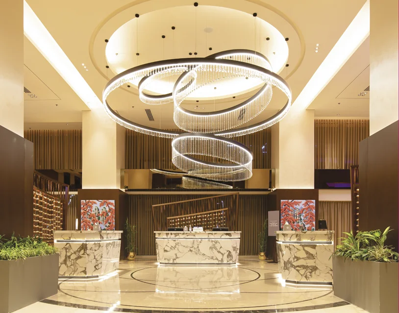
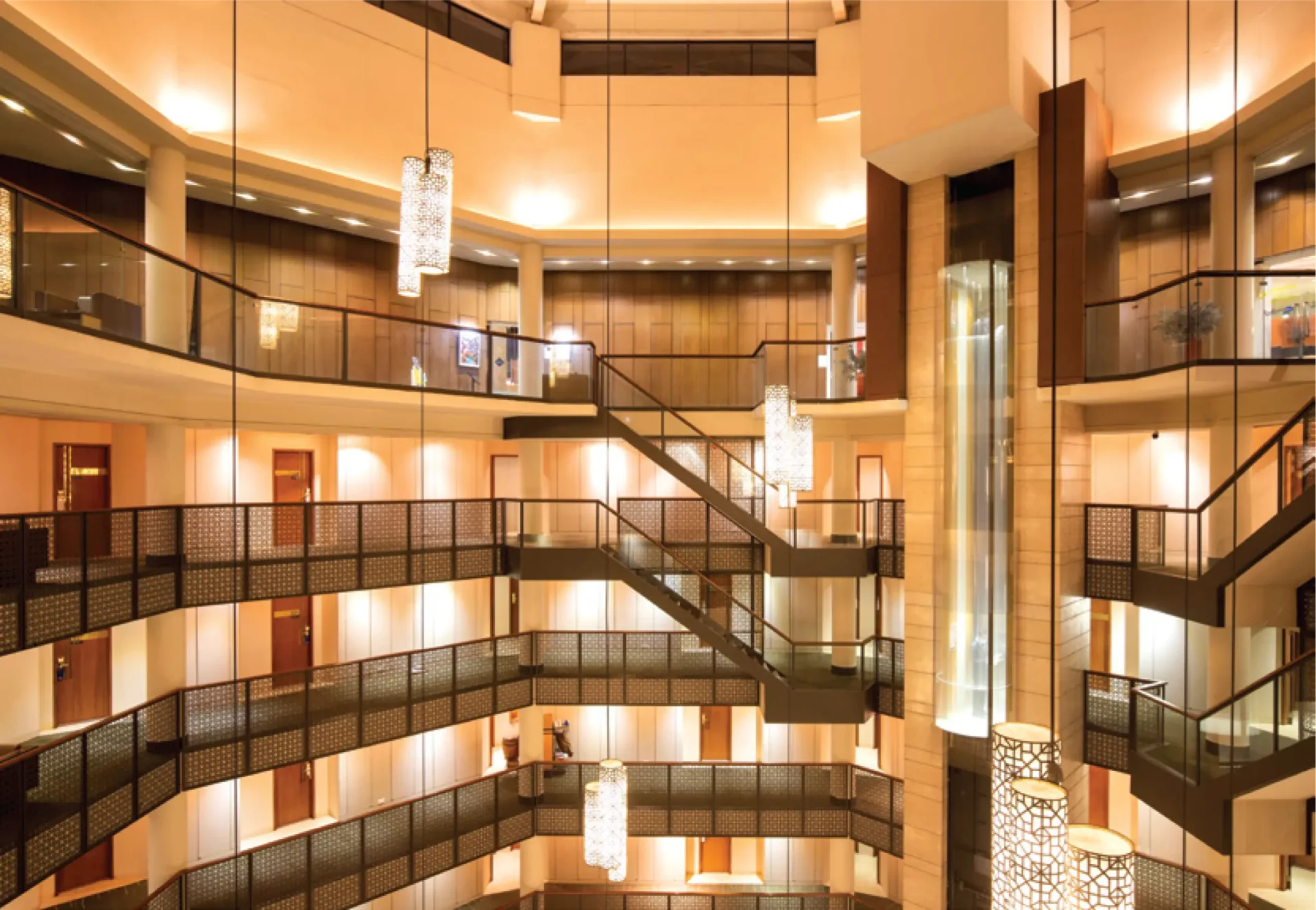
We rarely find a person acquainted with Dhaka who has not heard the name Radisson Blu Dhaka Water Garden or has not seen the iconic pitched roof building on the airport road. For years the name has carried the essence of luxury, exclusivity, and prominence to mass people. Just paying a visit to Radisson is enough to make someone feel special. Since 2006, Radisson Blu Dhaka Water Garden has been a prominent name in the luxury hotel market. The luxury and exclusivity with a touch of nature make it the perfect blend for people who want to experience proper five-star hospitality in Dhaka. Radisson Blu Dhaka Water Garden is between the city center and the airport area, making it easy to locate and access, especially for international travelers, including most of the target group. Being situated away from the urban chaos gives it a spacious room to breathe, making it worth battling through the Dhaka traffic to spend quality time with the city dwellers. The building stands as an icon of a five-star hotel in Dhaka city amidst water bodies and green landscapes. The whole area comprises 7-acre of land, but the building stands only on 2.5 acres, leaving the rest to embrace the natural landscape. It becomes hard to miss due to the fusion of Modernist architecture with the nostalgia of our traditional pitched roof. The project is a partnership between the property owner, Sena Hotel Developments Limited, and the multinational corporation, Radisson Hotel Chains, which provides quality management. International and local consultants worked together to develop the building by the brand criteria. Every element, from service, food, room amenities, comfort, building materials, and local experience to security and safety, is carefully designed to provide guests with a meaningful and unforgettable experience. The grand ramped driveway is one of its kind in this hotel. It is rare to find such a spacious approach in Dhaka due to the congestion and scarcity of land. One can see the unhindered view of the cityscape of Dhaka from the drop-off area, overlooking the wide airport road. After a careful security check, the ceiling height change to the lounge is awestriking. This open salon is visible from all floors above. Its height has been scaled down to human proportions by chandeliers of various sizes and height levels, which creates a more inviting atmosphere. The visual drama of the lounge and its modernist design, circular shape, and strategically placed features give the space an impressive appearance. It provides an interactive space for both the visitors and the occupants. The main entrance is from the first floor, and all the public functions comprise the ground floor and first floor, making it easily accessible without any contact with lift buttons or door handles- which proved to be highly useful during the Covid-19 situation. Radisson Blu Dhaka Water Garden, is one of the prominent names in arranging national and international high official Government and private events, particularly in terms of its security and hospitality. They offer versatile conference rooms that can accommodate up to 1,100 attendees, ensuring the success of events of all sizes covering approximately 3,000 square meters. The Grand Ballroom’s 990 square meters can accommodate a memorable wedding celebration or buffet. The Utshab Banquet Hall is available for product-launching-style events. Several boardrooms are also accessible for personal meetings, training courses, breakout sessions, and other smaller events. Healthy food over taste is a primary priority at Radisson Blu Dhaka Water Garden. The four restaurants and one bar named Blaze Entertainment Lounge & Bar, try to maintain the international standard in every dish. One can enjoy fresh, wholesome Bangladeshi cuisine at ‘Sublime’- a restaurant perfect for a romantic evening or an important client meeting. ‘The Water Garden Brasserie’ can be a perfect option for breakfast, lunch, or dinner, and choose from the international buffet and cook-to-order stations. ‘Spice & Rice’ offers a contemporary twist on Asian food, and ‘Chit Chat’, a deli café, can satisfy the cravings for savory snacks and sweet treats. They also have a dedicated space for smoking called ‘the Cigar bar’. The hotel business is going through a period of transition. The market has been divided into subsets to cater to a wide range of potential clients. Radisson Blu Dhaka Water Garden strives to appeal to locals and tourists by incorporating local cultural elements into its decor and the standard they promise. Radisson Blu Dhaka Water Garden offers accommodation services with its 200 five-star standard hotel rooms and suites. All the rooms have a balcony that offers stunning views of the hotel’s pool, rich landscape, and bustling city streets. In addition, they offer non-smoking floor services for the convenience of their customers. A significant feature of this hotel is the abundance of positive natural light seen throughout. At different times of the day, the play of light and shadow produces contrasting yet complementary effects. The garden, pool, and pond create sublime atmospheric peace. The pond area’s natural splendor lies in the fact that it has been preserved in its original setting, thus enhancing the genuineness and significance of the overall experience. The significance of this pond is enhanced by the jogging path that circles it. The open lounge area next to the pool, surrounded by organized nature, is a beautiful spot to spend some quiet time in the fresh air. The entire garden is planned such that there are always blooms to be seen, no matter the time of year. Radisson Blu Dhaka Water Garden, tries to encourage energy conservation and an eco-friendly environment. They reduce water waste by rainwater harvesting. The hotel promotes low and efficient water and electricity use by creating awareness whenever possible. They utilize as much natural light as possible indoors, given that most of the space is outdoors. The day light-sensitive technology used in light fixtures ensures minimal or no waste of energy. Radisson Blu Dhaka Water Garden promises to provide the best when it comes to service. However, finding skilled human resources who can meet the


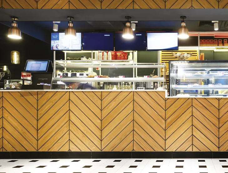


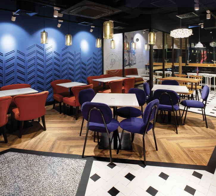
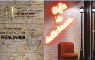
 Delifrance’s baked items are made with flour from the Grands Moulins de Paris, a major French milling company operating since 1919. The recipes served follow the franchise standards, and the new recipes also get approved by Paris. Hence, the international-quality chefs bring to the table a range of savoury dishes alongside croissants and other finger foods.