

With changing generations, the working culture along with its surrounding environment is evolving. As employees’ lifestyles become more comfortable, there is a greater demand for modern work life and space. One such example is the newly renovated headquarters of BRAC International. The office on the 14th level of the BRAC Centre is an exception in itself.
BRAC International is an international nonprofit organisation that works to empower individuals and communities affected by poverty, illiteracy, diseases, and social injustice. BRAC’s institutional expertise has successfully implemented programmes across 10 countries in Asia and Africa, impacting the lives of over 100 million people by adapting the models according to the context of the specific country.
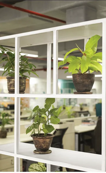
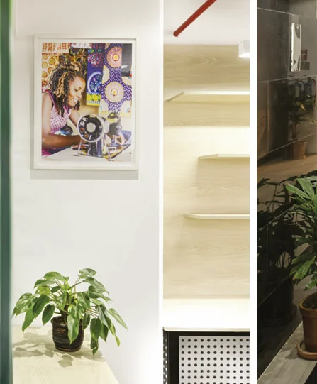
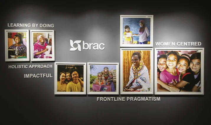
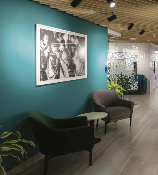
As an international nonprofit, BRAC International wanted to give a fresh look that reflected their cross-regional work as well as create a space that employees would feel proud to work in. Chinton Architects Ltd. implemented and executed the designing process, closely working with the Executive Director, Shameran Abed. The design draws heavily on BRAC’s values and their core brand DNA. The principal architects, Md Ishak Miah and Neeman Karim, along with the project architect Md Shakiful Islam Proshun and the team, designed a modern yet humble office space that draws heavily on earthy and nature-oriented office interior by using many leafy plants in the indoor office premise. There are also many beautiful photos of programme participants throughout the office to inspire the staff.
“Our new contemporary office interior is one of the first of its kind in the BRAC building and several other floors have been inspired to implement similar design elements on theirs. As BRAC International staff, we feel proud of our office and enjoy working here, while welcoming our colleagues from country offices who also feel good to have such a modern and beautiful head office,” Tania Ashraf, Head of Strategy, shared with Ceramic Bangladesh.
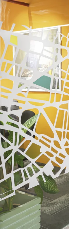
The eye-dragging view of the whole Banani and beyond is a very complimentary factor and helps the employees to release stress amidst working hours, not making them feel claustrophobic. The offices along the sides of the building are semi-frosted glass partitions with maps and skylines of major cities and countries where the organisation has a presence. The main meeting room features the Dhaka skyline.
“We wanted to create a workspace where people feel inspired to come and work. We wanted our colleagues to feel proud about working with Brac International.”
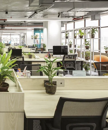
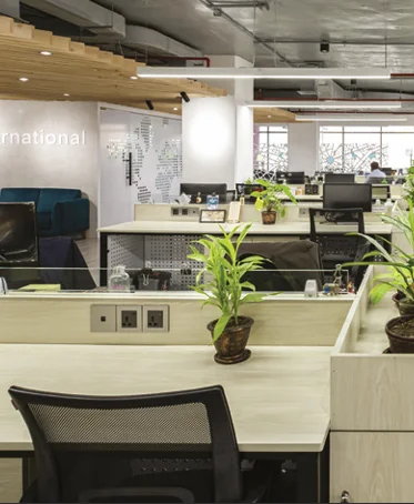
A few featured walls are dedicated to showcasing photos of programme participants. The four columns passing through the f loor showcase the organisation’s values – Integrity, Effectiveness, Innovation, and Inclusion. There are separate meeting rooms, which are interestingly named after the working regions. The big meeting room has clocks showing the timing of all the internationally affiliated countries. The office also has standing desks for employees to take breaks from long hours of sitting. Tania Ashraf added, “The lobby area has a collage of photographs from the f ield and reflects our DNA which is very much a part of our daily work.
Every morning when we come to work, we feel inspired by seeing these images as soon we get out of the lift. We wanted to create a workspace where people feel inspired to come and work. We wanted our colleagues to feel proud about working with BRAC International. As all of us work very hard, it was important for us to create a beautiful space where we can be productive as well as remember our purpose.
Authored by Rehnuma Tasnim Sheefa