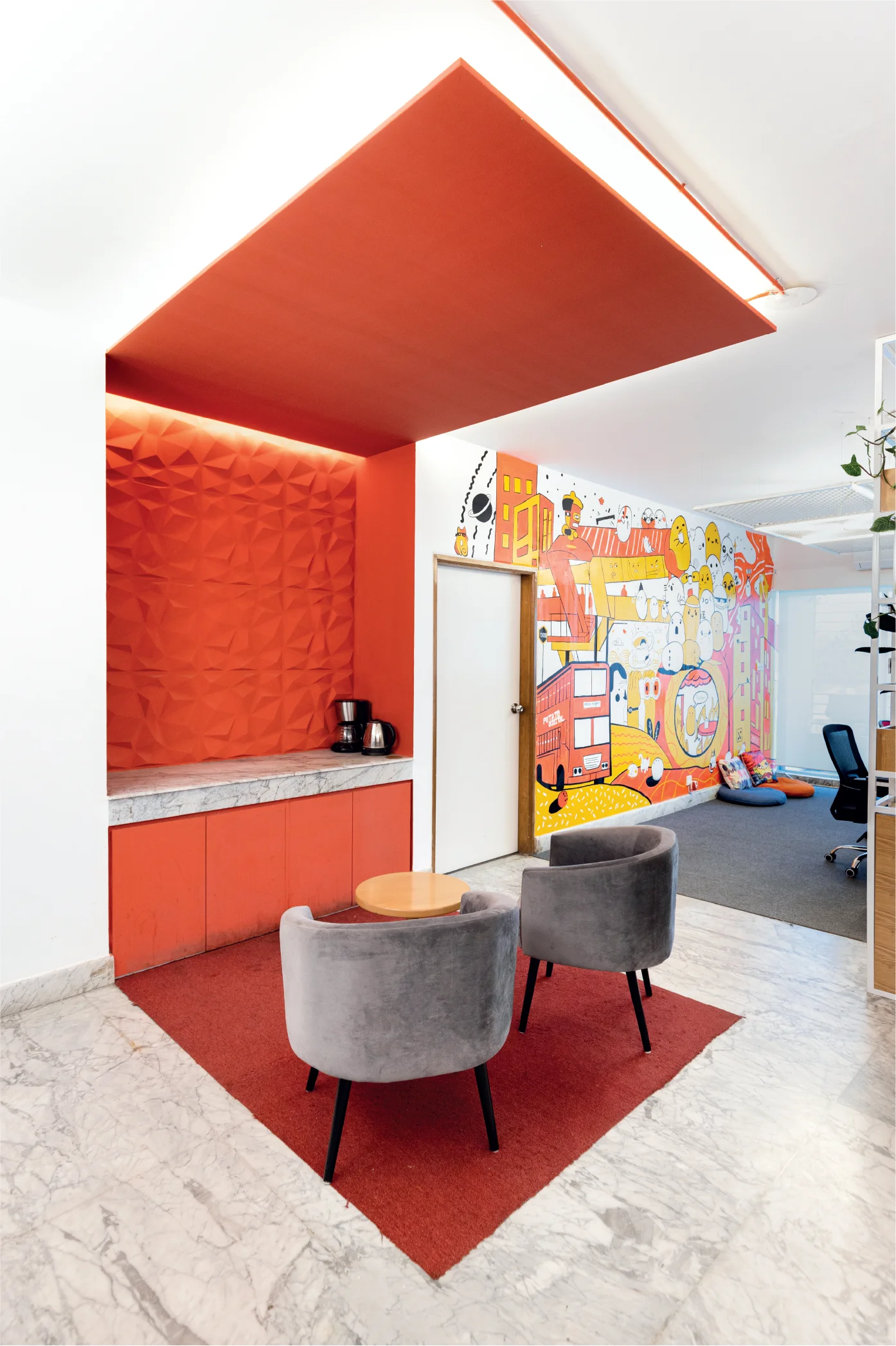
Designed by architects Sanzid Iqbal Rizvee and Rubayet Ferdous, construction for the Potato Digital Office commenced in May 2022 and was successfully inaugurated in June 2022. Remarkably, within a brief period of 45 days, the team efficiently designed and executed the vibrant space at their new Gulshan branch. Soon, the office turned out to be the talk of the town.
What’s Behind a Name?
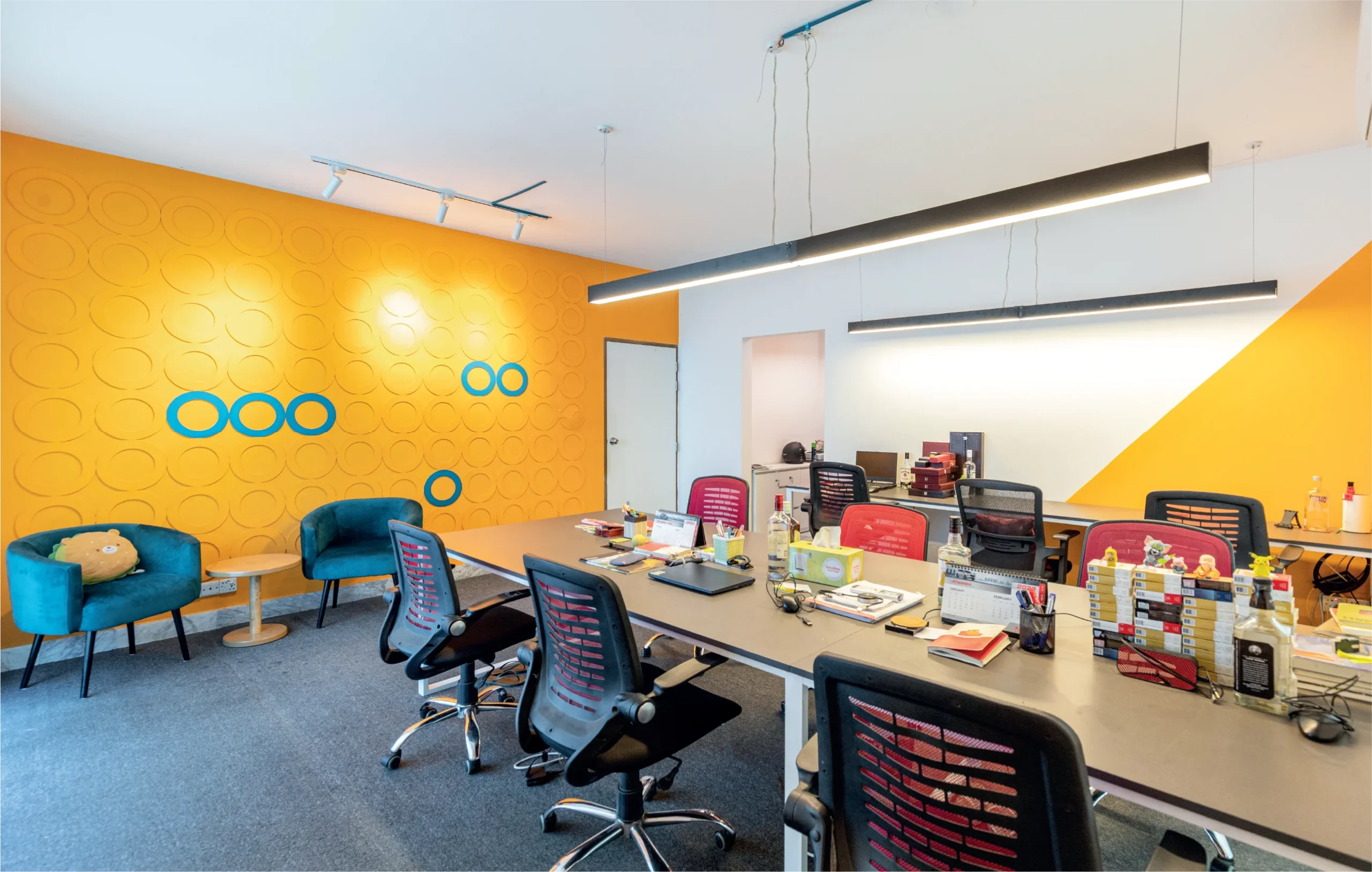
Potato Digital is a marketing agency where both the founding members and employees refer to one another as “potatoes,” embodying a unique sense of unity and camaraderie. This playful branding sets the tone for a lively company individuality. Inspired by this distinctive vibe, the designers embraced a funky approach, creating a vibrant and creatively charged environment to complement the brand’s identity. In terms of the client approach and initial design concept, Architect Rubayet says, “The clients at Potato Digital represent a casual, and funky vibe within their office space. Mark, one of the owners who hosts live music sessions, wanted a workspace where free-thinkers could evolve. Our main goal was to resonate with the youth of this generation. Fortunately, they were very receptive to our concepts and gave us complete creative freedom, imposing no restrictions on our open-minded ideas.”

Designing the Office Layout
The office layout comprised three distinctive zones. Firstly, the Creative Zone serves as the hub for brainstorming and ideation for generating innovative ideas. This is complemented by open workstations aimed at encouraging collaboration with clients. The second zone is the Client Service Area, dedicated to ensuring efficient and smooth client interactions. Lastly, there was the Directors’ Room, offering a private space for the key decision-makers. Moreover, a Resting Lounge was designed, providing a relaxing space for leisure activities, coffee breaks, gaming, and occasional music jamming sessions, reflecting the company’s vibrant and creative culture. Architect Rizvee, defining the primary requirements, stated, “Given the creative team’s frequent all-nighters, our focus was on creating a working environment that maximises both comfort and efficiency.”
In the creative zone, a captivating artwork can be found on one of the walls, narrating the fascinating journey of Potato Digital from Kalabagan to Gulshan. What makes this piece even more special is that the clients actively collaborate with the designers, becoming an integral part of the creative process. This graphical art adds a personalised touch to the interior design, as the shared identity of the employees as “potatoes” comes together in a unique storytelling experience through this art. “The whole office is designed in a way so that whoever visits there gets that vibrant feeling in every room,” says Architect Rizvee, adding, “We incorporated tic-tac-toe patterns on the ceiling, drawing inspiration from our beloved childhood games. This design element beautifully represents the creative zone through innovative lighting.”
Materials and Colour palette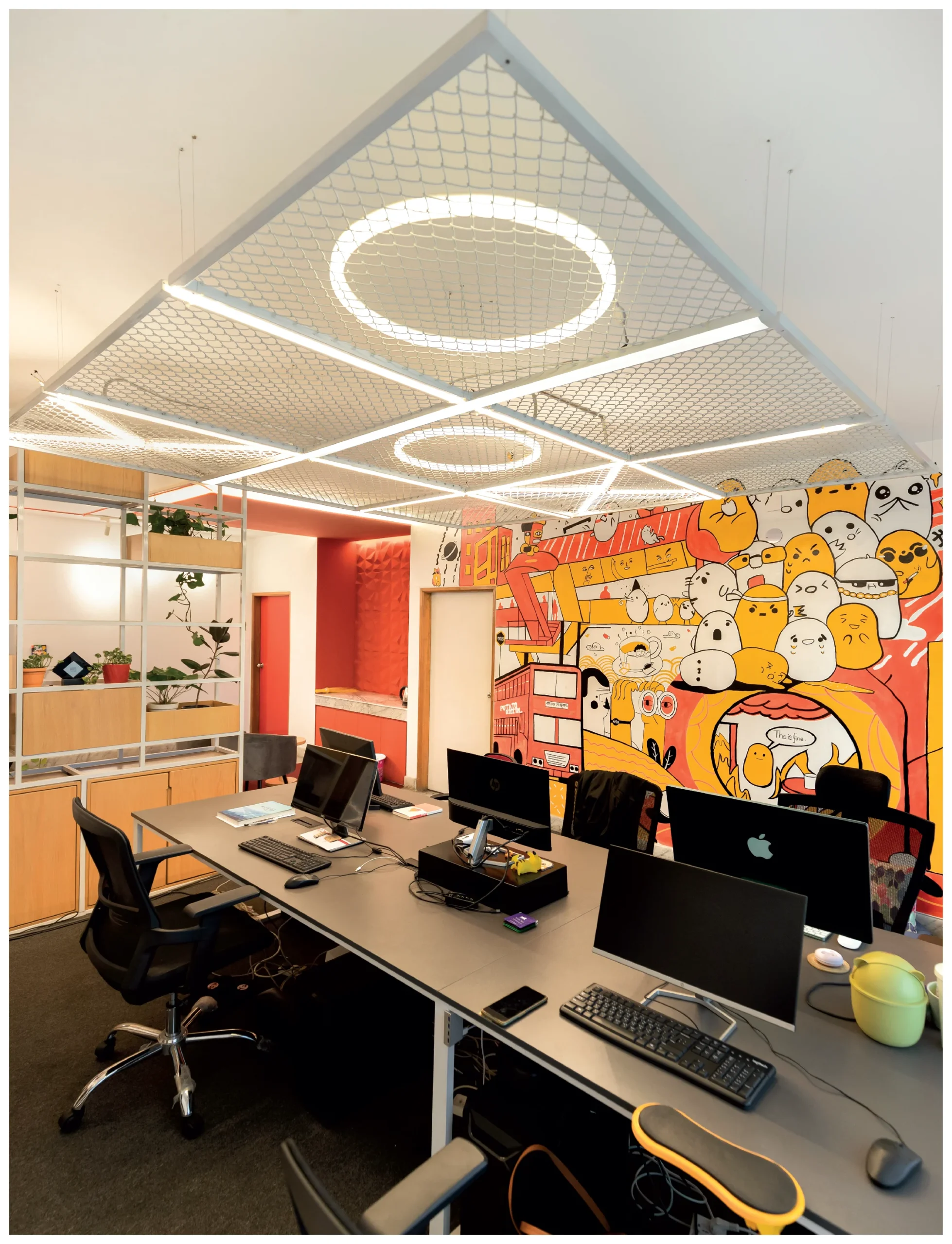
Regarding the materials and colour palette, the design incorporated metal and mesh on the ceiling, providing an industrial yet modern aesthetic. Workstations were built using boards, aligning with the desired functional and visual appeal. The colour palette predominantly comprised subtle hues like white, complemented by pops of bright colours for an energetic ambiance. The flooring featured a mix, with carpeted floors in most areas and wooden flooring in the lounge room, offering a balance between comfort and a natural feel.
Navigating Design Constraints
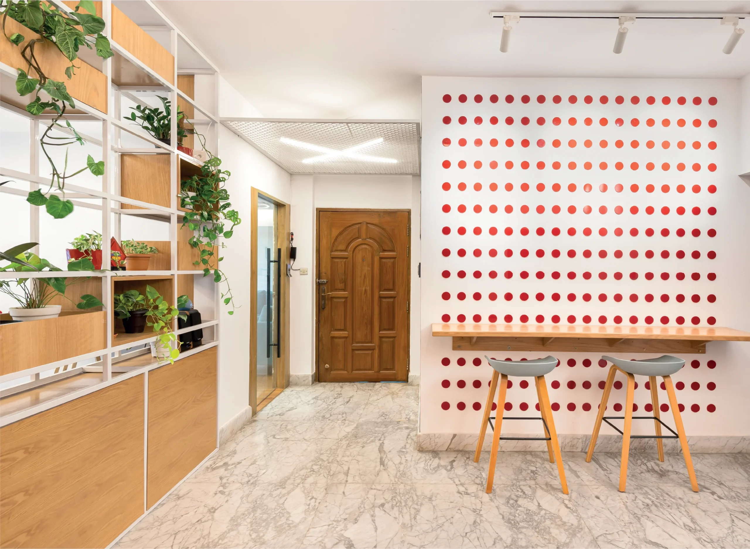
In discussing the challenges faced during the project, the architects brought attention to the door design. The initial plan was to colour the doors along with their frames; however, restrictions from the building owners prevented them from altering the door frames. As a result, a solution was devised where the door panels were carefully reinstalled to facilitate painting in the desired colour, maintaining the aesthetic vision. Another notable challenge was the limitation posed by the floor height, which closely resembled that of a standard residence in Dhaka. This constraint influenced the design approach, requiring thoughtful adjustments and considerations to ensure the optimal utilisation of space within the given height restrictions. Architect Rubayet explains, “To maintain an open and spacious feel without visual barriers, we carefully designed the ceiling with mesh, ensuring no visible obstruction despite the height resembling that of normal residences. Instead of wall partitions, we employed installations of planter boxes, ensuring a sense of permeability. Notably, the coffee corner was separated without partitions, defined solely by the choice of floor material, further enhancing the open layout.” Insights into how the vibrant and creative environment at Potato Digital impacts the users imply that productivity witnessed a remarkable increase. Team members autonomously stay focused on completing tasks collaboratively and amicably. “Efficiency saw a significant boost in productivity”, as shared by Farabi, who primarily collaborates with the design team. Productivity witnessed a remarkable increase, and team members now autonomously stay focused, completing tasks collaboratively and amicably. This enhanced work environment has motivated the team, fostering a proactive and driven approach to their tasks.
Illustrating DOTS!
The architects implemented a notable design element through the installation of red dots on the wall right after the entry. The red dots serve as a visual representation of the limitless nature of creativity. The inspiration behind this design was the concept, “Creativity is infinite”- much like the symbolism conveyed by the dots. Extending this creative concept, a similar approach was employed in another space with blue dots found in the client service room. Each blue dot symbolised a year of the agency’s successful six-year run. Architect Rizvee elaborates, “In line with our design approach of promoting collaboration, we dedicated a space for interactive and enjoyable moments to enhance employee relationships. The plywood circles, painted blue each year, served as a visual celebration of the agency’s annual achievements. “To maintain design harmony and continuity, circular lighting fixtures on the ceiling further resonated with this theme, ensuring a balanced and cohesive design.
About Studio Spire and its Vibrant Vision
Studio Spire, founded by Architects Sanzid Iqbal Rizvee and Rubayet Ferdous, officially began its journey in the field of architecture and interior design after their graduation in December 2020. Their collaborative partnership traces back to 2016, during their post-graduation years, as their synergy in work has been remarkably complementary with each other. Deviating from traditional office designs, they are revolutionising spaces with bright and vibrant design elements. Their focus is on energising and enhancing productivity, breaking free from conventional cubicles. Moreover, they draw influence from the impact of Instagram and social media, incorporating designs that are aesthetically pleasing and photogenic, amplifying the overall appeal for clients. Studio Spire actively seeks creative clients, aligning with their vision of “Vibrant and Colourful” as a distinctive interior design genre.
Written by Samira Ahsan
