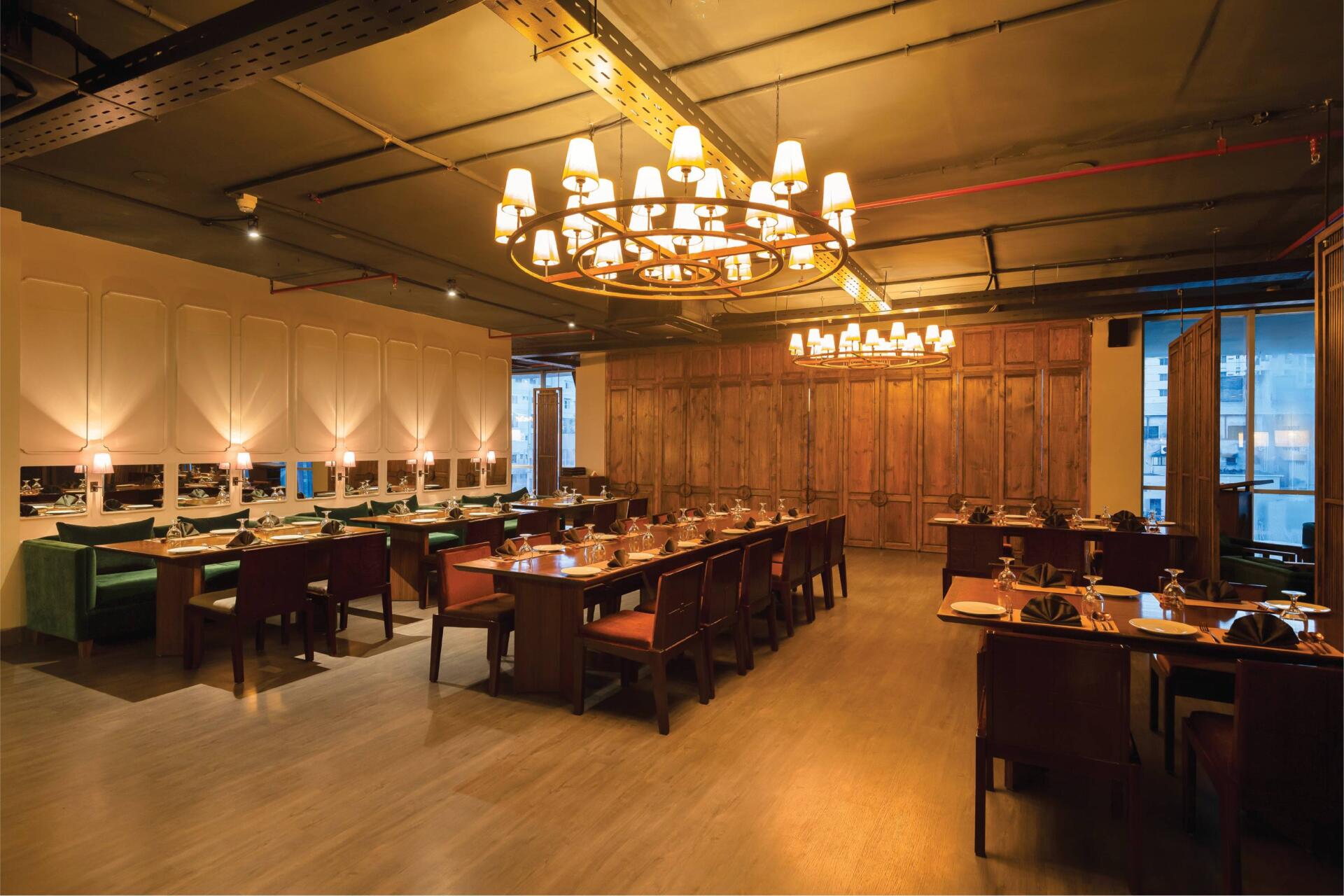
Thai Emerald Dhaka A Myriad Of Browns And Blended Greens
It’s a cosy Thai restaurant that transports one into the cultures and feels of Thailand through its rustic approach and earthy colour palette. So, be prepared to feel the vibes of Thailand and enjoy the warm atmosphere with a great dining experience. Most people know Thai Emerald as a go-to place to enjoy good Thai cuisine. Since its inception in 2012, Thai Emerald has strived to bring the flavours of Thailand to Dhaka – from Uttara to Gulshan to Dhanmondi – through its design and food. It has progressed over the years. Architect Rafia said their goal was to reflect the food served and the geographical setting of the restaurant while making the design. During the design of this restaurant, she used furniture and earthy tones similar to what she did with other restaurants to connect the brand and have a sense of reconciliation with the other two restaurants in town. A few of the dining chairs and the reception table and cash counter with the lotus motifs were elements that she had replicated to harmonise it with its predecessors. The wooden blocks situated on the backdrop of the cash counter pay homage to the second branch of Thai Emerald situated in Gulshan. The space was designed with efforts to keep the restaurant spacious to better accommodate large groups of people that frequent the restaurant. This was further highlighted by creating soft visual partitions through perforated separators or more solid partitions that allow big groups to co-exist with individuals or small groups while dining simultaneously. The architect wanted the diners to have elements to explore while dining at the restaurant – large cluster of doors separating private rooms, mirrored backdrops, or lamps hanging from the walls. The diners would have unique visual characteristics to ponder. She envisioned that people should be able to properly enjoy their time there. Thus, her goal was to create a warm, inviting ambiance with a play of dimmed, hand-crafted lights and splashes of earthy tones to create a soothing, delightful atmosphere for the customers. A focal element for this particular restaurant would be the doors, enclosing the private rooms, designed to be a point of attraction. “The reflection of Thailand is brought in through elements; for example, the lotus motifs in the door handles are a direct reflection. If you see Thai design, you’ll notice the use of softer lines rather than harsh straight lines, which have been reflected in the use of curved lines in the door details with softer, rounded edges,” the architect explains. Designing the small doors and playing around with the depth and lines was an interesting element that she loved when working on the restaurant. The architect wanted the doors to intrigue onlookers instead of having a dead space with boring partitions. In keeping with modern, contemporary design, the perforated partitions are made of sleek frames and thin lines to have a stylish outlook. A lantern of ‘Beth and Chatai’ was carefully designed and crafted in the escalator zone near the entry to give passersby and incoming guests a taste of what unfolds inside. The lantern, which was a focal point, was an experimental design by the architect to challenge the bounds of what could be made with flowy waves instead of the traditional circular design. The architect also worked with multiple local artisans to create custom-designed hand-crafted lights and chandeliers made of local materials like cane, wood, bamboo, and beech. The service corridor is lined with basket-shaped hand-woven lamps that lead people into the restaurant. A mix and match of kerosene wood, gorjon wood, and plywood were used to form the wooden elements displayed in the restaurant. An essential portion of the design was focused on creating a curated colour palette of browns and greens with a touch of grey to avoid having any harsh colours and instead opt for a homogenous, complimentary, soothing colour palette. The earthy tones are further accentuated by using browns that have grey undertones so that the overall output looks well-groomed. Grey texture paint was used to highlight a wall; it includes a chamfered rectangular punch that allows a visual connection with the service corridor. “We decided, deliberately, not to use any blinds on the windows; I want the existing floor-to-ceiling windows to let in ample daylight during the day so that customers can enjoy the sun, and it also gives a spectacular view of the city during the night, “the architect said when asked about keeping the floor-to-ceiling glass windows open. She added that they have not yet had any problems regarding heat gain from the facade. A signature personal style that the architect incorporated into the design was variation in designs of the door knobs used extensively throughout the space. Starting from the door handles of the private rooms, they feature lotus halves, so when closed, they form a full lotus. The door handles were placed much lower than the standard height to create a varied look when all the doors are closed together. The door handles of the restaurant doors have linear wooden handles on glass doors, and the toilet door handles are curved inward to create a unique motif. The restaurant of Dhanmondi, too, has two entrances to cater to both lifts on opposite sides leading to the restaurant floor, a fact unique to this restaurant. The ceiling is left open to have a modern industrial feel and is painted grey to match the vibe of the restaurant, with only a thin red line of the sprinkler system showing up on the ceiling as a touch of colour in accordance with the building safety regulations. A large painting of an elephant is hung on one of the feature walls as an homage to not only the heritage of the restaurant but also to tie bits of Thai cultural elements into the atmosphere. As you enjoy dinner with a loved one in this bustling restaurant, it is possible to have an immersive Thai food experience with plenty of laughs and

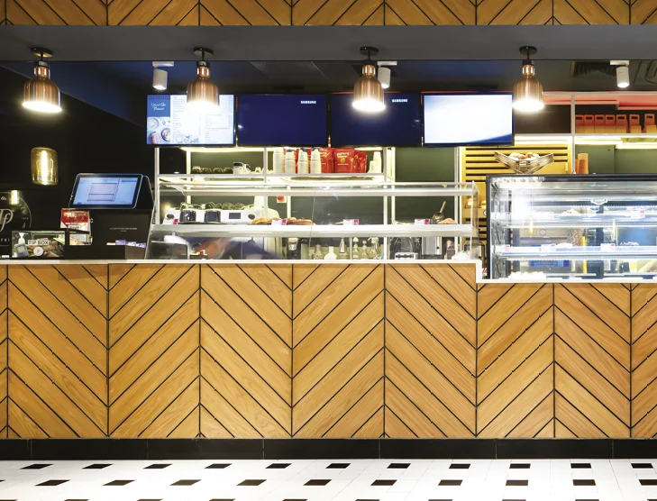
Prologue to Paerns Emerald Bakery and Cafe
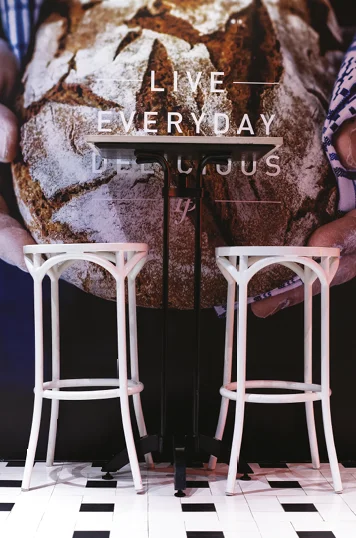
As muffled conversations and. farewell notes of jazz float up to the sky – the baker gets to work. The bassline and flour have charted a path; the stage has been set. Somewhere in the throes of dawn, the musician and baker find harmony. Lost in their fundamental desire to put together ingredients that make magic; they make something anew. The aroma of bread and notes of the accordion dance together; inspiring and emulating. Food and music universal languages that speak to us all. While crossing the busy street of Banani 11 in Dhaka city, you can randomly walk into the recently launched Emerald Bakery and Café. Owned by the family behind Emerald Restaurants, the Emerald Bakery started its journey with a small shop in Uttara back in 2018. It was initiated by Shamima Rahman with her dream of stepping into the bakery market, and moved to a bigger space within the food court at Chef’s Table in Gulshan. But overall Emerald Restaurants is co-owned by Shamima Rahman (mother), Aminur Rahman (father), Shaker Ibne Amin, Sabbir Ibne Amin and Ayeman Ibne Amin (sons). Shaker Ibne Amin found a gem of a location; one of the very few independent houses left that can be used commercially. This opportunity encouraged them to dream of a street-side venture, not confined within a tall structure made of steel, glass, and concrete. Hence with this new thought process, the Emerald Bakery and Café went through a rebranding. The new branding has a core value of using patterns, as suggested by Prianka Ameen, who worked along with the designing firm, Inked Studio, to wrap this concept throughout the whole café and packaging. “Bakery is science, where measurement is the key and patterns are very mathematical by nature. However, we also wanted to make our place cozy and homely, creating an ambiance that one experiences in a family-run bistro. Therefore, perfectly made patterns would be too rigid and organised for us. Therefore, we decided to go with handmade/drawn patterns, where each motif is flawed yet unique. We have taken this concept to drive the whole design process; from branding and our menu to the architecture,” Sabbir Ibne Amin said while explaining his wife’s concept. Before intervening with the venture in a new location they surveyed and studied a lot of human behaviour. That is mostly how Inked Studio works, being a human-centered design studio. Hence, they tried to build a place where one can work individually, plan office meetings, hang out with office colleagues or friends, have family dinners, or just spend a lazy afternoon with a book. These use cases helped generate the design, the seating layouts, lighting, and sound panels, and Parisian-influenced subtle and muted colour palettes, mostly inspired by nature and the colours from their dishes. Patterns have been made on feature walls using simple and rudimentary techniques. Blocks used for drawing patterns on the f loor have been repurposed to see thru panels that separate open spaces. There is a conscious repetition of elements but in a very organic and uneven way. The paintings of different sizes have been printed and framed first before deciding which walls they belonged to, just as the way one buys paintings for our homes. Mostly the paintings chosen are of classic female painters, although famous among art enthusiasts, are not fairly represented to the masses as opposed to their male contemporaries. Therefore, about half the paintings are works of female artists such as Tamara de Lempicka, Irma Stern, Emily Carr, and Suzanne Valadon. Prianka Ameen, the food consultant for Emerald Bakery, worked closely with Mr Ayeman and the chefs to design and develop the menu. As the cafe business is competitive where they have established The Grove Bistro, Gusto, and Trouvaille, Ms Prianka was tasked with designing a menu that could differentiate “us”. “Studying European and North American cafes and bistros, we came up with our very own twist of a concise, healthy, and diverse menu. Our dishes reflect the comfort and homeliness while strengthening the identity of being both a cafe and bakery,” Mr Sabbir added. The architectural project was led by Inked Studios, a design firm where team members from different fields and expertise work collaboratively to design, develop and execute ideas. Designers who worked on this project from Inked including Zehra (anthropology and literature), Auhona and Navid (Architecture), Redwan (Hospitality Management and Client Servicing), Nashad (Art and Visual Design), Ayeman (Business Administration and Entrepreneurship), Sabbir (Mathematics and User Centered Design) and Zara (Business Administration). The brand line for the bakery and café is the food that syncs. Every project under Inked Studio and Emerald Restaurants has a concept and story behind it. As the venture grows old, it changes but the core concept always remains the same, just as a human. Authored by Rehnuma Tasnim Sheefa


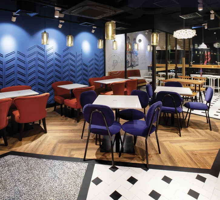
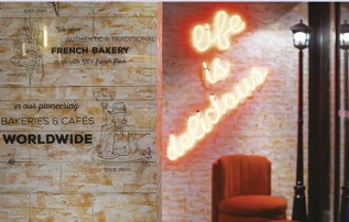
 Delifrance’s baked items are made with flour from the Grands Moulins de Paris, a major French milling company operating since 1919. The recipes served follow the franchise standards, and the new recipes also get approved by Paris. Hence, the international-quality chefs bring to the table a range of savoury dishes alongside croissants and other finger foods.