
Imagine being able to spend a peaceful evening with your loved ones in the middle of Dhaka’s hectic city life, where indoor and outdoor areas flow together to form a kid-friendly environment. And now, in O’play, it’s all come to life.


Imagine being able to spend a peaceful evening with your loved ones in the middle of Dhaka’s hectic city life, where indoor and outdoor areas flow together to form a kid-friendly environment. And now, in O’play, it’s all come to life.

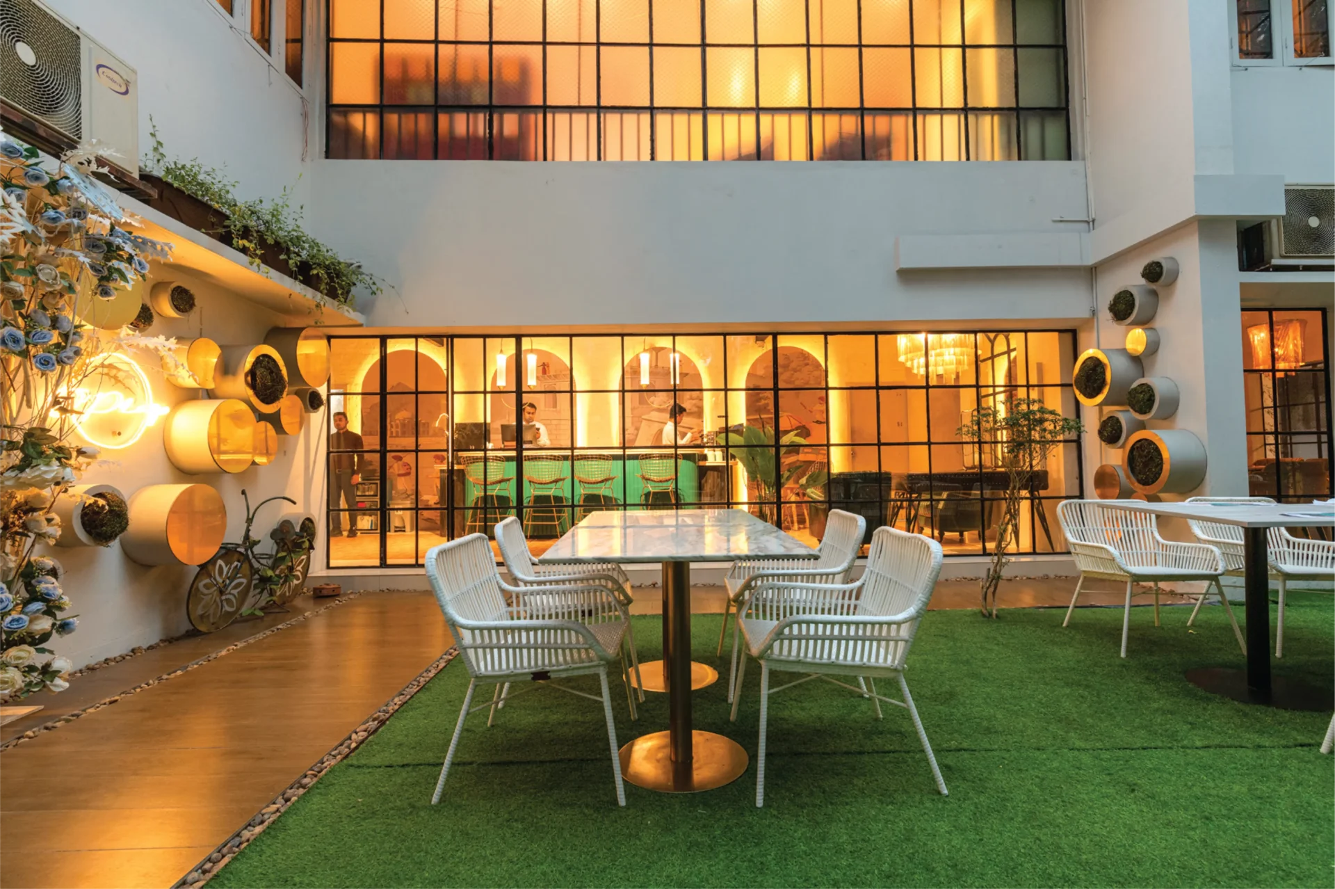
For those who enjoy café culture, a delightful spot has opened its doors to Dhaka’s vibrant crowd. Nervosa is a cafe located on Siddheswari Road, Dhaka, at the edge of a bustling neighbourhood—just above Brutown, which has long been a favorite in the heart of Bailey Road. Why Nervosa The name, “Nervosa,” is a deliberate nod to the beloved sitcom Frasier, where a fictional coffee shop of the same name served as a backdrop for the characters’ daily lives. Sabeel Rahman, CEO and Proprietor of BruTown and Nervosa, explains his choice with a playful intrigue: “The question of ‘Why Nervosa?’ is what makes it captivating. It draws attention, it’s a memorable name.” Consider Nervosa as the upscale, fancy, artistic neighbor of the popular cafe, BruTown, finding its niche in the community. Behind the Scenes Rehnuma Tasnim Sheefa, the principal architect of Parti.studio elaborates on the design philosophy: “Every design develops from a concept or a vision and if for a restaurant or a cafe, the branding has its influence as well. For Nervosa, that concept was built on strong character and a vibrant color palette, designed to draw a younger crowd into the cafe, as envisioned by the owner. When working in a public realm like cafes, as an architect I also had to focus on the psychological impact a person would have with the colors and the characters.” The color palette evolved gradually. Pale Orange took precedence, aligning with the theme initially, with striking illustrations bringing life to the walls. To make the illustrations stand out, a monochrome backdrop was introduced for the floors, ceilings, and other walls, allowing the boldly patterned and colored furniture to shine truly. The exposed brick on some of the walls adds a touch of urban grit, while the wooden flooring brings warmth and texture; keeping them aligned with the basic pale orange color. The cafe culture in Dhaka thrives on connection. Comfortable seating arrangements encourage heartfelt conversations, from an upcycled plush couch perfect for intimate gatherings to communal tables fostering spontaneous interactions. Nervosa goes a step further with cozy bookshelves stocked with comics and novels, perfect for anyone who wants to settle in with a good read. Instagrammable Spots Several strategically placed elements aim to create visually captivating ‘Instagrammable’ moments. The journey begins at the entry staircase, where a whimsical illustration introduces the cafe’s personality. Upon entering, a prominent neon light sign immediately catches the eye. Inside, a one-of-a-kind waffle mirror greets you at the entrance for your mirror selfies with your friends. Track lights are incorporated here to highlight specific areas, making them ideal for photos. “You will also find the neon lights in different spots around the cafe”, shares Architect Sheefa. The use of neon lights is an interior design trend in restaurants targeting younger crowds, particularly Gen Z. They create a visually appealing and Instagram-worthy atmosphere, making restaurants more attractive to social media-conscious customers, to create a unique and memorable visual experience. illustrations that speak to you To add character to the interiors, the beams and walls are filled with vibrant illustrations. In the beam above the counter, the illustrated characters resemble the target audience of the cafe, and how they interact and behave. Describing the artworks, Mashqurur Sabri, the artist, shares, “Nervosa walls are a burst of young energy and Dhaka madness — messy, loud, and full of heart. The hand-drawn, sketchy art style mixes raw lines with pops of bold, chaotic color — think warm reds, electric yellows, moody teals — capturing the city’s wild rhythm. From buzzing rickshaws to rooftop chill scenes, it’s the city on caffeine — vibrant, warm, and wide awake.” “When I think of Nervosa as perceived by the public, I wish it to be known as the most happening place in Siddeshwari,” says the owner, Sabeel Rahman. The vibrant interior, the playful name, and the strategic use of social media-friendly elements all point to a well-thought-out strategy. Nervosa isn’t just serving coffee; it’s serving an experience. And if the initial buzz is anything to go by, it’s an experience that Dhaka’s café-goers are eager to embrace. Written by Samira Ahsan

Residing in a quiet corner in Dhaka’s Gulshan area, one can find a mini-Europe as soon as s/he spots Raffinato. “Raffinato Ristorante Italiano” – just by seeing the name, one can already sense its Italian essence. At the first glance, I noticed a cozy, two-story white house with an L-shaped stairway leading to a small balcony, which gave more of a European home vibe.
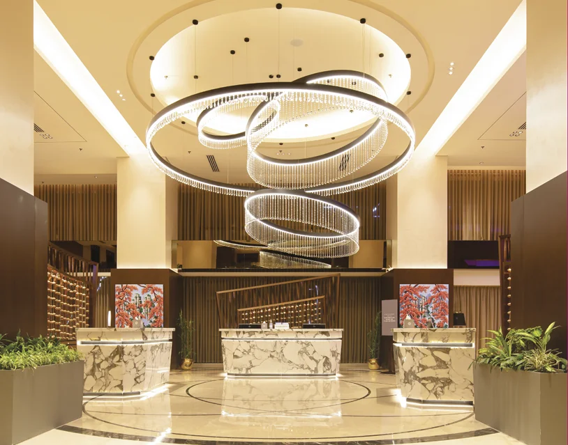
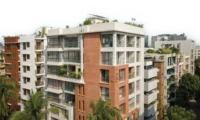
Since the 90s, Sheraton has been one of the prominent names in the luxury scene of Dhaka city. Many of us have fond memories of weekend morning strolls and fun with parents near the poolside landscapes. As the city grew, so did the urbanscape, the economy, and hence a shift of luxury being more contemporary with the time. Sheraton Dhaka in a new location in Banani is an excellent example of the recall value of a brand. The interesting friction with the prior location is that the city dwellers are still getting familiar with and accepting the nostalgia within the new vertical opulence. The contemporary and trendy expression is a boon to the new generation of entrepreneurs and business enthusiasts, alongside the youth crowd. The location of Banani is in a merging mesh of formal and informal zones, may it be corporate offices with the big business companies or a hub for youth to hang out and collaborate. “The new business model of the brand is to connect these dots,” shared Md. Al Amin, Hotel Manager and In-charge of Sales and Marketing. He also added, “Sheraton’s slogan is ‘Where the World Comes Together’ and Sheraton is community which is about ‘We’ rather than ‘I’.” A premium hotel is not just about a beautiful architecture or posh interiors serving the brand value, but the services and how the functionality works. One of the basic guidelines for any hotel is to design the circulation and utility of the spaces. As we visually experience the front of the house and its ambiance, the back of the house provides smooth services subconsciously yielding ease. Since 2016 the 81 years old operating Sheraton Brand became a part of Marriott International. This shift has been an improved revamping session for the brand protocols. As per the brand guidelines, all the designs are executed. High-end and prominent local architectural consultants and a Singaporean design consultancy firm collaborated with the Marriott International design and management team for the execution process. The active participation and suggestion of the local owner, a seasoned hotelier, added value to the output. The hotel has a gourmet café called Toastina, a buffet restaurant and alfresco named The Garden Kitchen, On the Rocks -a whiskey bar, and a high-end Japanese restaurant, Yumi. One of the biggest column-less ballrooms in the city, spanning approximately 8000 square feet. A club Lounge for Club Room Guests and for top-tier Marriott Bonvoy members, a gym with the best city view, spa facilities, and many other support features of a modern and upscale hotel. Marriott International is specific about the arrangement as they achieved the class over the years. Everything is per the standards, from the washroom amenities, mattress, and bed linen to the kitchen layout and room sizes. The restaurant has all freshly imported ingredients to maintain the quality. The hotel is a no-smoking zone. Due to the new branding value of communal developments, the sitting arrangements are for a larger group of people. “Sheraton being a full-service hotel does not just limit itself to bed and breakfast, but rather the ambiance ambiance and overall experience of the service. Sheraton has one of the largest hotel footprints overall within the Marriott’s Brands. Sheraton considered as a flagship in the Dhaka is region,” shared Mr. Al Amin. In an Exclusive Interview with Daniel J Muhor General Manager, Sheraton Dhaka 1. As per the memories of the 80/90’s people and kids, luxury hotels meant the Pan Pacific Sonargaon (existing) and the Sheraton Dhaka, at the present premises of Intercontinental. That shift of nostalgia from a lawn-based architecture to an urban upraised scraper. How do you feel this change is appropriate? There are advantages and disadvantages. People are experiencing a positive shift, just at times struggling between the present and previous location, but still adaptive. For better reference, we are addressing it more emphasized as Sheraton Dhaka, Banani. People are responding to the recall value of the brand. As the land occupancy is getting concentrated in Dhaka city with land as such from Banani, one of the most expensive ones in the world, it is tough to plan the layout horizontally. The location shifted alongside the architectural style from horizontal to vertical planning. Having the fact of generating revenues, every square foot matters. If land such as in Banani gets used for urban landscaping and ground-level outdoor spaces, it would have been tough for the owner to generate revenues. But we have kept an open alfresco area that serves as an outdoor landscape, and at the top, the poolside area adds to it as well. And the panoramic views as you go up the floors add a new experience. Overall, we feel it is an urban retreat within the hassle and bustle of the city. 2. Most people are observing the contrast between Banani supermarket and a five-star rated hotel. How was the selection of the property made keeping such an interesting combination? Initially, the Banani supermarket was a worrying factor. But the existing structure has been a great fortune. The podium coverage that we have is approximately 44000 square feet. And there are lots of examples of shared land-use systems of commercial spaces worldwide. Many premium hotels are operating this way. The owner is investing to improve the ambiance to smudge the contrast. Hence, the supermarket is getting upgraded, increasing its value and the property value parallel. The lower few levels of the market are louvered from outside. The entrance is more decorated, providing a better experience for the people visiting the market. The roots are important too, and the addition of Sheraton will cocreate the landmark. The users need help to be educated about the usability of the facilities in a better way. 3. Hotel and their hospitality differ in many experiential and served ways. How Sheraton, Dhaka is planning to be exceptional in this developing range of upcoming hotels? The hotel’s one of the best-selling points is one of the biggest pillars less ballroom, in a busy