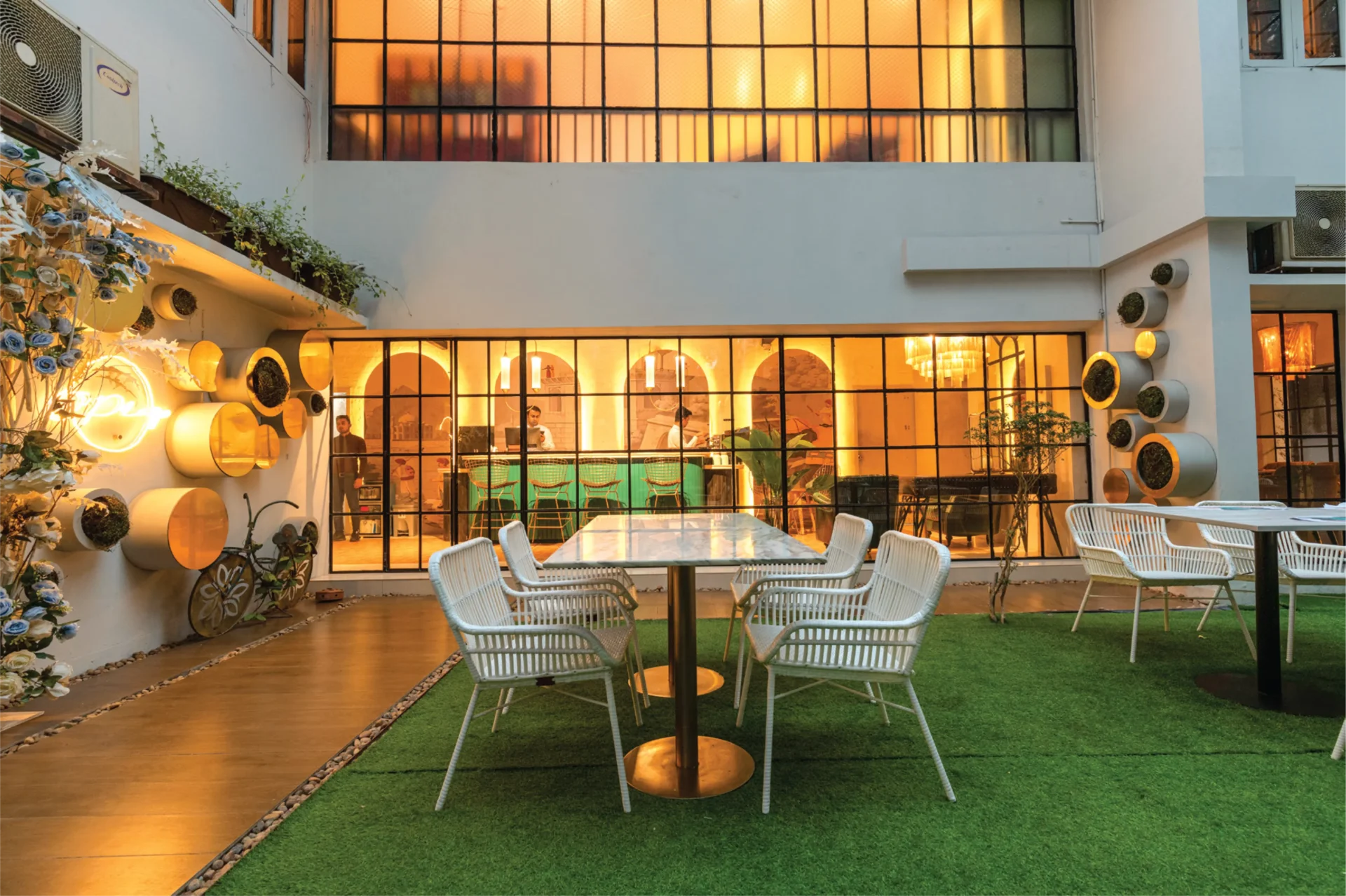

Imagine being able to spend a peaceful evening with your loved ones in the middle of Dhaka’s hectic city life, where indoor and outdoor areas flow together to form a kid-friendly environment. And now, in O’play, it’s all come to life.


Imagine being able to spend a peaceful evening with your loved ones in the middle of Dhaka’s hectic city life, where indoor and outdoor areas flow together to form a kid-friendly environment. And now, in O’play, it’s all come to life.
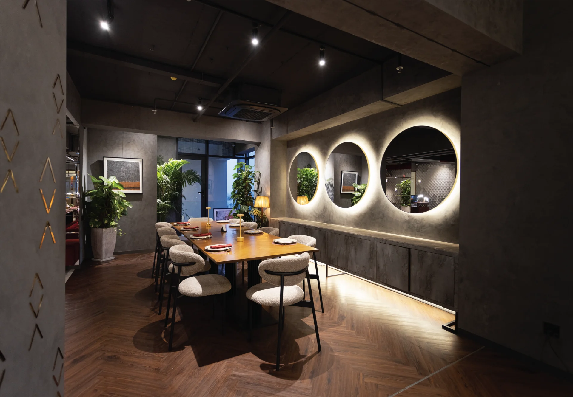
At the heart of any remarkable restaurant lies its design—a subjective blend of form and function. The design itself becomes a storyteller, weaving narratives of contemporary tradition. The walls, the textures, the colours—they all tell a story.
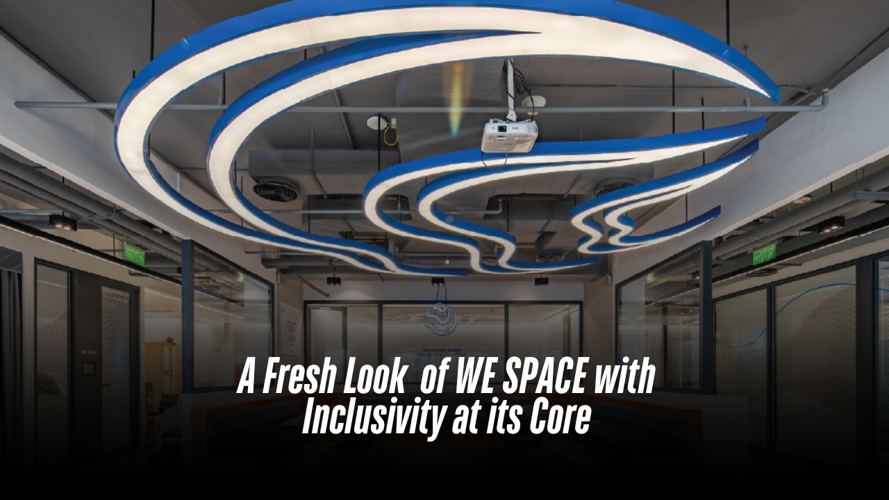
In the bustling Gulshan North Avenue of Dhaka, a unique office concept in Bangladesh replaces traditional departmental segregation and hierarchy with freedom of workspace and teamwork. Located in a prime location of Dhaka’s business hub, WE SPACE is Woolworth’s Group’s Bangladesh office, co mprising an area of 6,300 square feet. The entire project was completed in 90 days, which was a challenge in itself. The spaces in this project have been designed with Woolworth’s inclusive concept of “WE” and togetherness in mind. This concept is reflected in the layout, flexible workspaces for users, and an interesting colour palette that complements the brand identity. As per the question, Sudeshna Shireen Chowdhury, the founder and principal architect of Studio.O, explained, “All functions are arranged together in a loop. If you enter the office from one side, you can come back and end up in the same space.” Inspired by the concept of “We Space,” the layout has been developed with a central collaborative social hub and town hall space as the heart of the office. Upon entering, a clean, central circulation spine welcomes the user into the space. This loop leads them towards designated zones, which are specifically marked to enable easy navigation. The design ensures universal access for both circulation and entry into all spaces, promoting proper orientation and mobility. Overall, the office space has been designed to be exceptionally user-friendly, showcasing unique details and features while upholding the brand identity of Woolworth’s Group. Architect Sudeshna explains that there are no designated seats or fixed workstations. The concept is for all functions to be connected in a loop, allowing users to enter from one side and return to the same space upon exiting the loop. The design team did not introduce a traditional reception area, as the other Woolworth’s offices do not have one either. The zoning prioritises common areas, meeting rooms, and a multifunctional room near the entrance for guests. The kitchen, designed more like a coffee pantry, is also placed near the entrance for easy access by guests. Public spaces are readily accessible upon entering the office. “As you move further inside, you’ll find the workspaces located near the terrace space,” as explained by Architect Sudeshna. All the furniture for this project has been locally sourced and designed, making it exclusive to the users and the office. Hatil provides modern, space-saving compactor storage that allows for a significant amount of storage within smaller areas. Height-adjustable tables and workstations were made locally using handmade techniques. The vibrant colour palette within the workstations incorporates orange and green shades. A unique feature is the collaborative table they designed. It can function as a whole table for four people or unfold into individual workspaces. One of the most striking features of the space is the ceiling. The Woolworth’s logo is cleverly incorporated as a ceiling light fixture, adding a unique and memorable touch to the ambiance. The clients loved this detail and are considering replicating it in our other branches to create a consistent and memorable brand experience. Vinyl flooring is used throughout the space, with a colour scheme that complements the blue ceiling light to further highlight the blue colour in the ceiling and the brand association as well. No partitions were used in open spaces; the variation in the texture of the floor materials separates the zones. Biophilic principles were considered throughout the design process. Planters were strategically placed to integrate nature into the workspace. The architect adds, “We always consider biophilic principles. So, we planned where the planters would go and designed accordingly.” The meeting room features a TV panel that doubles as a whiteboard, demonstrating a smart design element. Acoustics were also a priority. To minimise echo, a false ceiling with sound-absorbing panels was installed. Carpets were also used for the same purpose. In the main workspaces with exposed ceilings where talks and town hall meetings are held, sound-absorbing carpet flooring was used. Another unique addition to the project was the soundproof office pods for four people. “These pods are fully furnished, offer 85% sound absorption, and have their own ventilation systems,” explains Architect Sudeshna. She further adds, “Every space has its own identity. There is a focus zone, a collaborative zone, and a social zone, all with different kinds of identities and characters.” Completed in January 2023, WE SPACE is a collaborative project by the eminent architecture firms Studio.O and Binyash, located in Dhaka. The team of architects brainstormed together to come up with a concept that ensures efficiency, comfort, and a positive ambiance for office users. Architect Sudeshna Shireen Chowdhury concludes, “Working with the Woolworths team was an exceptional experience. We appreciate the unparalleled support from our partners.”
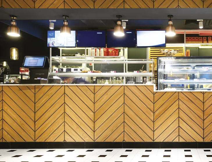
Almost everyone who watched Western movies felt compelled to sample the aroma and atmosphere of a Frenchstyle bakery. Del france in Dhaka is the right place to get tapped on that subconscious note. Abid Mansur, Managing Director, Les Bleus Ltd., and the conveyor of Delifrance in Bangladesh, has been enticed by the healthcare and wellness sector as a squash enthusiast, but by the influence of memories, filling the gap of a perfect French bakery in town happened. The basic rule of the house is to make room for a improvements every day. The previous airline business of the family was a good help with the catering services taken as experience. Yet restaurant is not just about food but the experience of service and ambiance. Athula Priyankara, the CEO, leads a team that provides promised services. The ultimate happiness of customers is what their motto has been; that is what brings them back. Delifrance’s baked items are made with flour from the Grands Moulins de Paris, a major French milling company operating since 1919. The recipes served follow the franchise standards, and the new recipes also get approved by Paris. Hence, the international-quality chefs bring to the table a range of savoury dishes alongside croissants and other finger foods. The requirements and interior designing instructions came from a European interior design company, followed and designed by a local architectural consulting company, Chinton Architects Ltd. Starting from the colcur codes to the variation of sitting arrangements, the company has been under international protocols of the franchise. The play of experiences within the space has been the main focus and desire. Neeman Karim and Md. Ishak Mia and their team had previous experience designing for international companies, which eventually helped them implement the work gracefully. A very chic yet welcoming environment, defined by the themed colour palette consisting of bright orange and shades of blue, looks prominent. The basic layout provided by the European company had been well fitted and adjusted within the space. The materials are sourced locally and customised to the desired details, making the process sustainable. The segmentation and zoning of the restaurant are very noticeable and organised with the variation of chairs, lighting and flooring. “Our lifestyle is mostly oriented around fast food and visiting” The walls have intricate details, different textures, paneling, and branding posters. Ceramic tiles were cut and customised on the floor to achieve the desired effect. The ambient light has also been curated with a variation of pendant lighting and contemporary chandelier styles. The lingering aroma of the buttery delights, the buzz of the youthful city crowd, and the everlasting French discernment combine to create a packaged affair that anyone walking past Gulshan Avenue would relish. Authored by Rehnuma Tasnim Sheefa