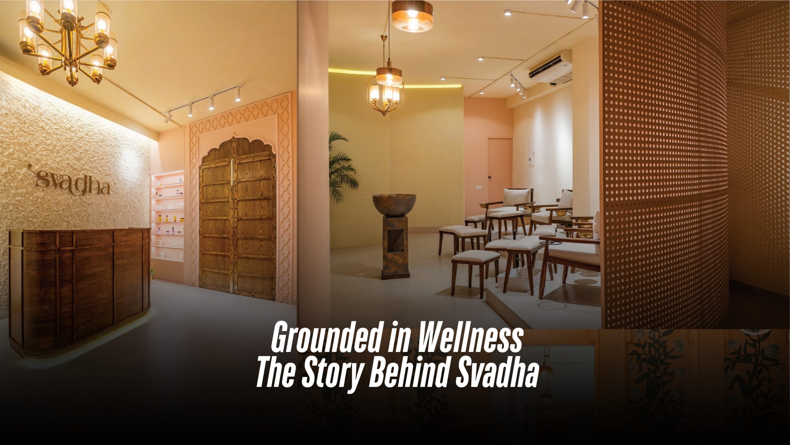
Grounded in Wellness: The Story Behind Svadha
Over the past decade, Bangladesh’s spa and salon culture has gone through a quiet but striking revolution. The once-flashy, first-service catered parlours have given way to curated wellness havens that prioritize experience over gimmicks. From Faux-Thai facades, a new design language is emerging. At the forefront of this transformation is Svadha, the country’s first salon to fully integrate Ayurveda into its core philosophy. But it’s not just their services that set them apart, it’s the atmosphere. Their aesthetic blends the royalty of Mughal architecture with the earthy soul of Marrakesh, creating a space that feels both grounded and luxurious. Svadha is a family-led vision brought to life by Rumjhum Fattah, her brother, Md Golam Rezwan, and sister-in-law, Behtarin Chowdhury Ridma. While the trio has long been a part of Bangladesh’s RMG sector, Svadha marks their first foray into the world of beauty and wellness, and they’re doing it on their terms. The name Svadha, derived from Sanskrit, beautifully translates to “self-care” and “self-love”—an ethos that defines everything the brand stands for. “At Svadha, we’re not here to sell beauty or grooming services,” says Rumjhum. “We’re here to create a space where people can slow down, tune in, and prioritize their well-being.” Svadha is located in the heart of Gulshan Avenue and comprises a total area of around 3300 square feet. The interior, designed by the creative minds at Studio R.A.R., is a visual and sensory ode to stillness, grounding, and mindful indulgence. “Svadha is a true embodiment of peace and tranquillity,” shares co-founder Behtarin Chowdhury Ridma. “From the lounge to the treatment rooms, we wanted every inch to feel like a retreat, where the stress of daily life simply melts away. To achieve that, we explored a palette of earthy tones and tactile, natural materials.” She pointed out that most salons in the city are built around speed and efficiency, often at the expense of comfort. “Everything is so fast-paced—walk in, get the service, walk out. There’s hardly ever a moment to truly unwind,” she reflected. At Svadha, the philosophy is deliberately different. The space is intentionally kept open and airy, avoiding unnecessary partitions or a heavy-handed layout. “We wanted to let the space breathe, just like our clients,” she added. There are no false ceilings or forced divisions; instead, the design embraces fluidity, allowing natural light and movement to flow freely. Catering to working women, Svadha brands itself as a wellness retreat. “Our clients come not just to look good, but to feel good. After long hours at work, they deserve to be unrushed, cared for, and truly pampered.” Drawing inspiration from Moroccan and Indian architectural traditions, the space features intricately carved wooden mirror frames, classic oil lamps, and a striking antique doorway that sets the tone from the moment you enter. A gentle water fountain hums in the background, further enhancing the atmosphere of calm. “We wanted to infuse the space with elements of nature and its calming rhythms,” shared Rumjhum. “The water fountain, placed thoughtfully within the layout, is a quiet homage to that intention, a gentle nod to movement and serenity. Throughout the space, you will find indoor plants too” Lighting, too, was carefully curated to complement this ambiance. There’s a deliberate avoidance of harsh, bright lights. Most areas are bathed in soft, ambient illumination, dimmed and mellow to encourage relaxation. However, in zones like the makeup and hair stations, where precision is key, the lighting is thoughtfully intensified to ensure clarity without disrupting the overall calm. One of the standout features of the salon is the textured wall next to the reception where the metal brand name is hung. There is also a graffiti wall, commissioned by a Fine Art student of Dhaka University where Mughal-themed flowers are painted. Every piece of furniture in the salon has been custom-crafted in-house. Each zone has been thoughtfully planned to serve its specific purpose, whether it’s a quiet waiting lounge, a private treatment room, or a styling station. Every detail, down to the custom-built furniture, typography on the walls, and curated lighting reflects Svadha’s vision of a wellness destination that feels both intimate and elegant. Written by Kaniz F Supriya
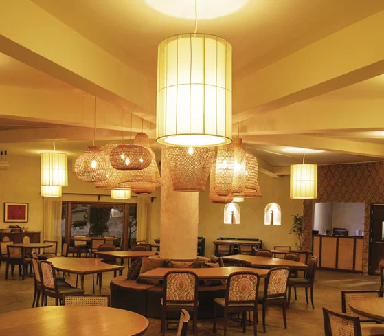
Tradition Wrapped In Modernity: Terracotta Tales
In the fast-moving pace of Dhaka city, do we not all feel the need to slow down, away from the chaos, experience the presence of the surroundings, and stay in the moment? Inside the premises of the Tejgaon branch of Aarong, Terracotta Tales pays homage to the local craftsmanship. It is a place dedicated to the warm and sentimental dishes and the comforting and heartfelt ambiance that make us long for home. Rafia Mariam Ahmed, principal architect of Hive Architects, designed this beautiful restaurant having intimate dialects with details. When an individual experiences space, what does make one recall it? What works there is the phrase: “design is in the details.” The goal of embracing details is to get you to think critically and present the best possible solution —right from the beginning. That is why details are important. They can keep us coming back, or they can keep us from coming back. And definitely, that comes from a good number of researches. Terracotta Tales is one such location where traditional village home details are infused into a minimal modern portrayal. Terracotta Tales and the adjacent bakery, Dough Diaries, are in a joint venture with Aarong. They are one of the restaurants under the Emerald Restaurants, with other operational restaurants being: Thai Emerald, The Red Chamber, Grove, Trouvaille, Gusto, and Emerald Bakery. The structure the restaurant belongs to was initially designed by Vitti Sthapati Brindo Ltd. alongside the Aarong outlet. The outlook of the structure, starting from the large openings, landscape, and interior to the detailed texture on the outer surface – all were later added as the journey of designing this tale began. The theme and menu of the tale were to be Bengali cuisine, from where conceptualisation of the space began. “I started going back to our roots of being a Bengali. I wanted to pick the elements so rich with history, which had been used daily in our culture, for so many years, and blend these elements with modernity. I wanted to design a space that would take us back to where we belong, a place more oriented towards slow living,” Ms Rafia shared. The space is an abstract representation of a mud house, the softness of which is found in the details of rounded corners of walls, doors, and windows. The unevenly matte polished surfaces with raw, warm earthy colours take you to the affection of the rural aura. Even at night, the lighting is as such to create the ambiance of a warm-toned hue of “prodeep” (dimmed fire lamp). The centre light pieces are delicately handwoven cane shades. Terracotta has been used in many details of this space. In the shade of the walkway, with that of the semi-outdoor space on the rooftop, and the centre of attraction is the wall of the stairway that leads to the rooftop dining. The wall is composed of thin slates of terracotta tiles arranged in triangular patterns, which creates dialects with the light from the sky at different hours of the day. The lanterns used in the rooftop space are also custom-made of burnt clay. As clay is a vital component of humans, country, and roots, the concept and name were associated with terracotta to represent its power of affection. Tales of local artists and craftsmen were incorporated into the design by the use of cane lanterns and clay lamp shades and the famous “Tepa Putul” (a local handmade clay doll of a specific style). Potters and artists made larger sizes of these usual small-scale dolls that are placed on niches as commonly seen in the mud houses. Framed rustic metal jewelry and decorative mirror are added to the wall to represent the daily used materials in a rural mud house. The landscape is designed to wrap an individual with nature. The restaurant is pedestrian-only, with no vehicular connectivity directly, focusing on the practice of being close to nature. The walkway has a beautiful line of bamboo trees on one side and specifically selected floral trees on the other. There is also an outdoor sitting area where the hard surface meets the green in an undulating line. A small body of water curves along the structure is an abstract form of “pukur” (a pond) as commonly seen in the rural context. Ms Rafia said, “The mere attempt was to get out of the edged effect of modern city life to a more mellow and soulful experience – Where one can only indulge in the presence of themselves, the company, and, of course, the food. The trees shed flowers and leaves, creating an inviting bed of nature for the people exploring the outdoors. The curved walkways toward Dough Dairies also give you a feel of the rural memories.” The subconscious nostalgia with the cane-woven furniture details makes one reminisce childhood memories from the ancestral homes. The utility area has been partitioned with cane-weaved partitions to camouflage it in the interior. The wooden curtain rails and the door handles add value to the theme, complementing the colour palette. A few subtle colours are added by using a floral print material on the back of the seats, preventing the guests from feeling monotonous. Old ceramic plates are decorated on the wall, making a spectacular composition of colours, history, and belongingness. On a bright sunny afternoon, when the sun kisses the shallow water next to the large window with curtains of translucent softness, the sheening glitter of the rippling water reflecting on the ceiling catches one’s attention while being indulged in the nostalgic local cuisine. The soul runs through the handcrafted details and the softness of the ambiance makes one feel warm, cozy, and at home. The modern city crowd is so much more over-oriented towards a captivated lifestyle that even a natural splash of water becomes a form of irritation. Terracotta Tales is a space to celebrate that naturally unnatural necessity of life that people are slowly getting carried away from. Authored by Rehnuma Tasnim Sheefa


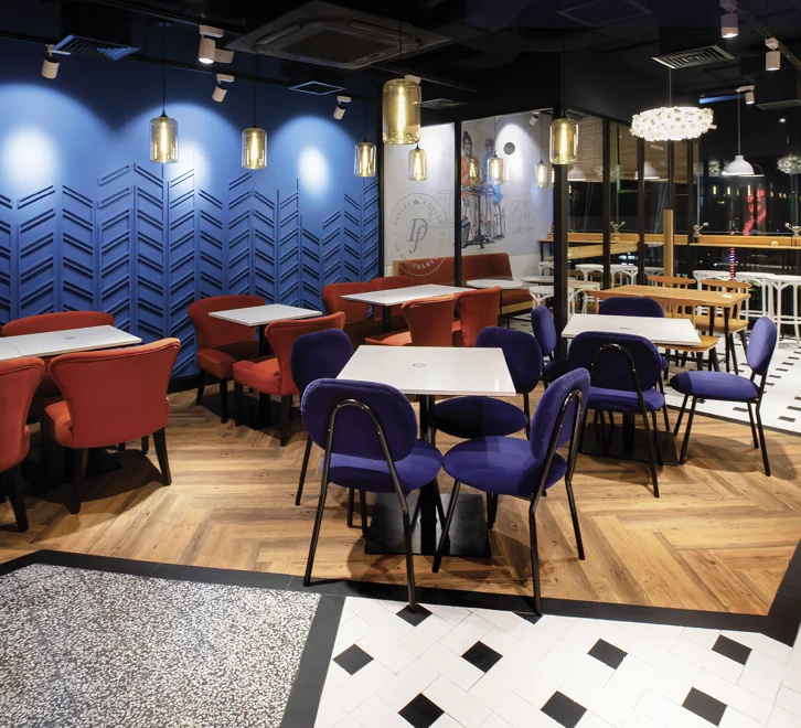
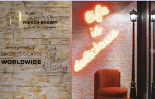
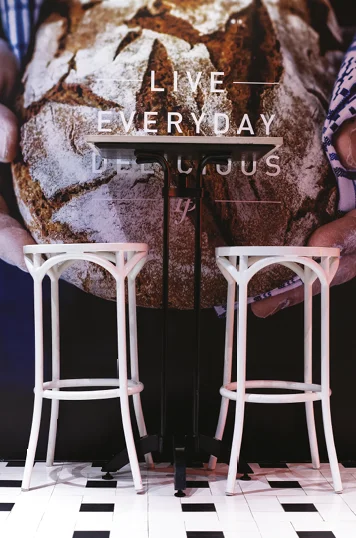 Delifrance’s baked items are made with flour from the Grands Moulins de Paris, a major French milling company operating since 1919. The recipes served follow the franchise standards, and the new recipes also get approved by Paris. Hence, the international-quality chefs bring to the table a range of savoury dishes alongside croissants and other finger foods.