It’s a cosy Thai restaurant that transports one into the cultures and feels of Thailand through its rustic approach and earthy colour palette. So, be prepared to feel the vibes of Thailand and enjoy the warm atmosphere with a great dining experience.
Most people know Thai Emerald as a go-to place to enjoy good Thai cuisine. Since its inception in 2012, Thai Emerald has strived to bring the flavours of Thailand to Dhaka – from Uttara to Gulshan to Dhanmondi – through its design and food. It has progressed over the years. Architect Rafia said their goal was to reflect the food served and the geographical setting of the restaurant while making the design. During the design of this restaurant, she used furniture and earthy tones similar to what she did with other restaurants to connect the brand and have a sense of reconciliation with the other two restaurants in town.
A few of the dining chairs and the reception table and cash counter with the lotus motifs were elements that she had replicated to harmonise it with its predecessors. The wooden blocks situated on the backdrop of the cash counter pay homage to the second branch of Thai Emerald situated in Gulshan.
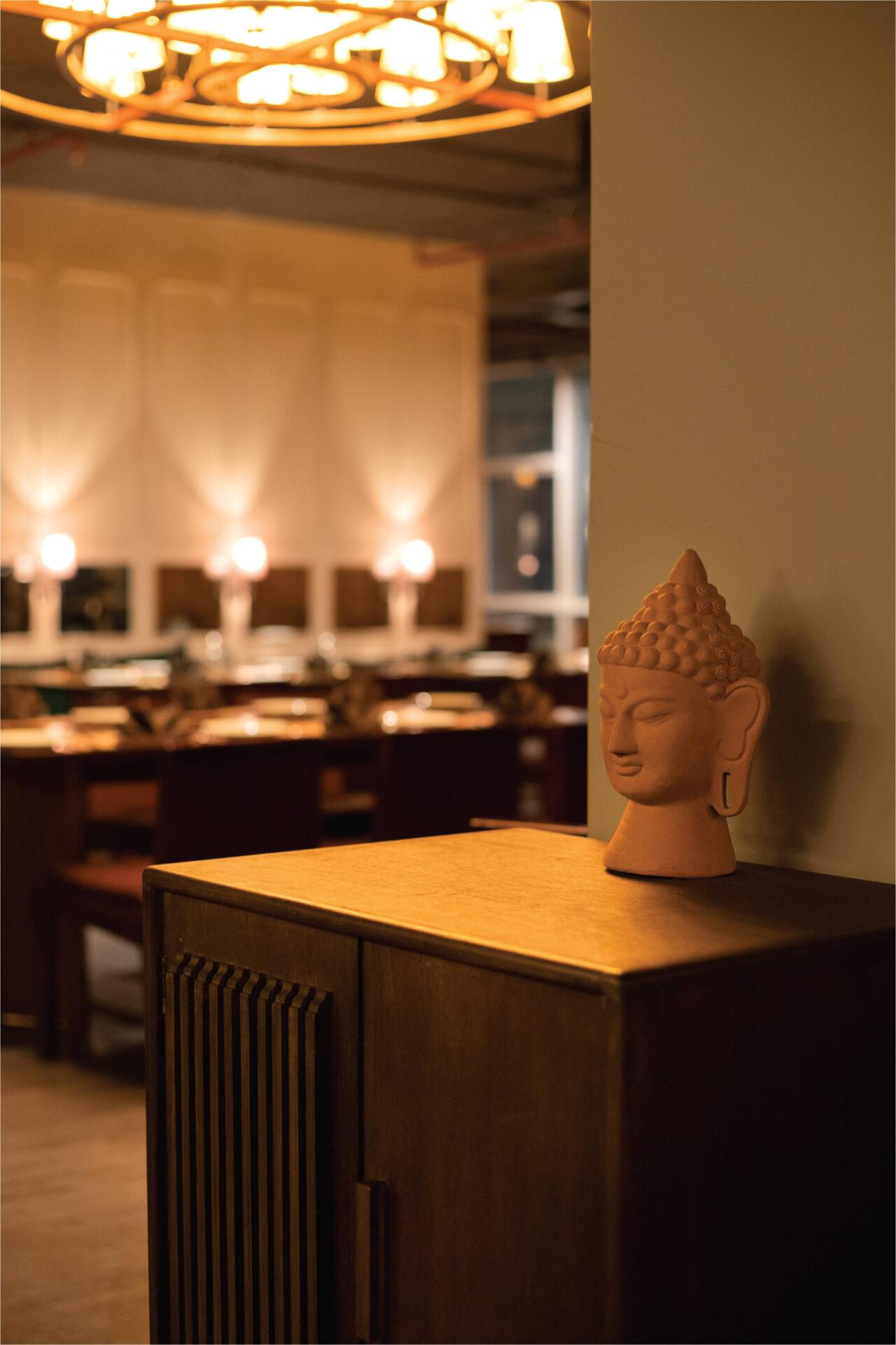
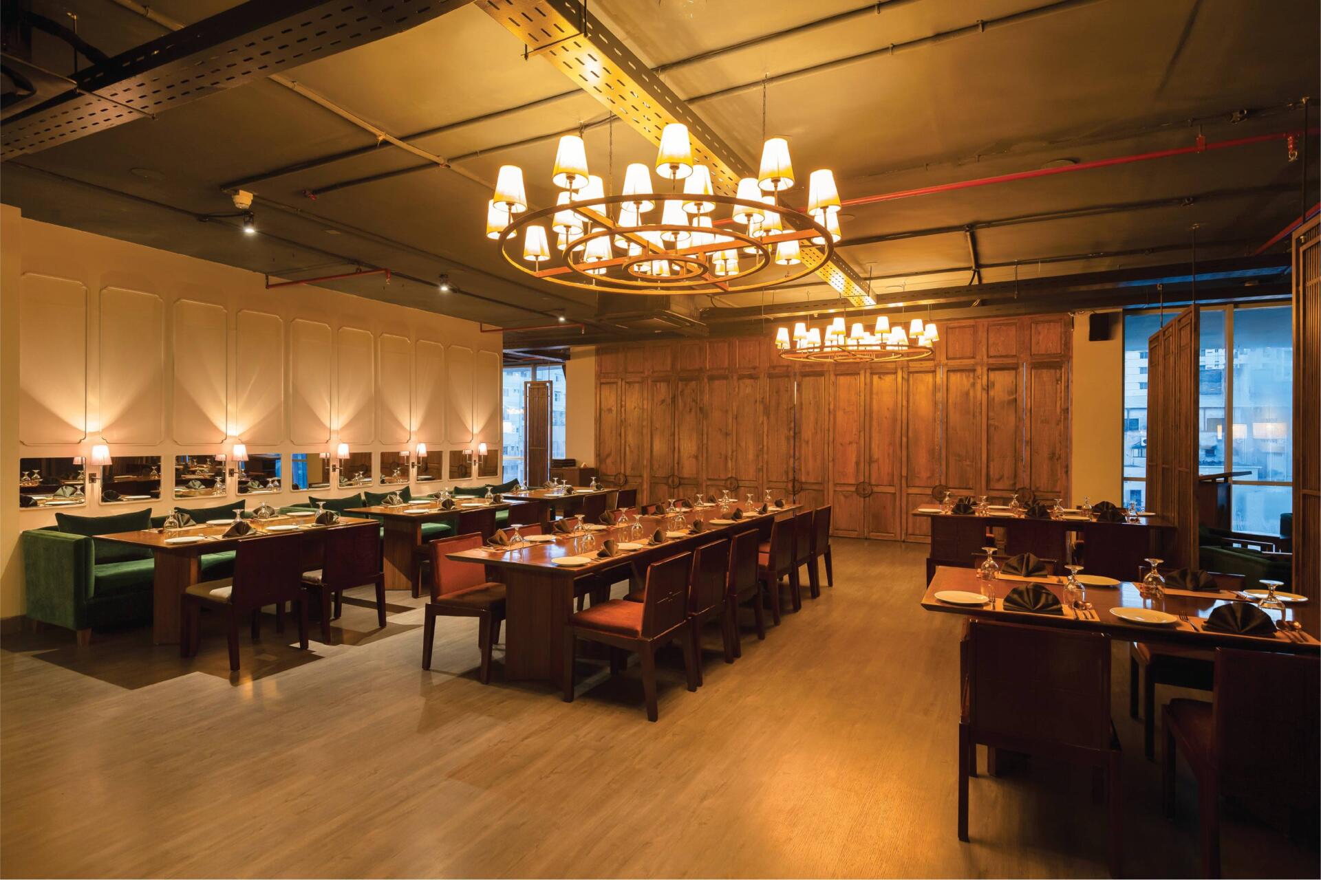
The space was designed with efforts to keep the restaurant spacious to better accommodate large groups of people that frequent the restaurant. This was further highlighted by creating soft visual partitions through perforated separators or more solid partitions that allow big groups to co-exist with individuals or small groups while dining simultaneously.
The architect wanted the diners to have elements to explore while dining at the restaurant – large cluster of doors separating private rooms, mirrored backdrops, or lamps hanging from the walls. The diners would have unique visual characteristics to ponder. She envisioned that people should be able to properly enjoy their time there. Thus, her goal was to create a warm, inviting ambiance with a play of dimmed, hand-crafted lights and splashes of earthy tones to create a soothing, delightful atmosphere for the customers. A focal element for this particular restaurant would be the doors, enclosing the private rooms, designed to be a point of attraction. “The reflection of Thailand is brought in through elements; for example, the lotus motifs in the door handles are a direct reflection. If you see Thai design, you’ll notice the use of softer lines rather than harsh straight lines, which have been reflected in the use of curved lines in the door details with softer, rounded edges,” the architect explains. Designing the small doors and playing around with the depth and lines was an interesting element that she loved when working on the restaurant. The architect wanted the doors to intrigue onlookers instead of having a dead space with boring partitions. In keeping with modern, contemporary design, the perforated partitions are made of sleek frames and thin lines to have a stylish outlook.
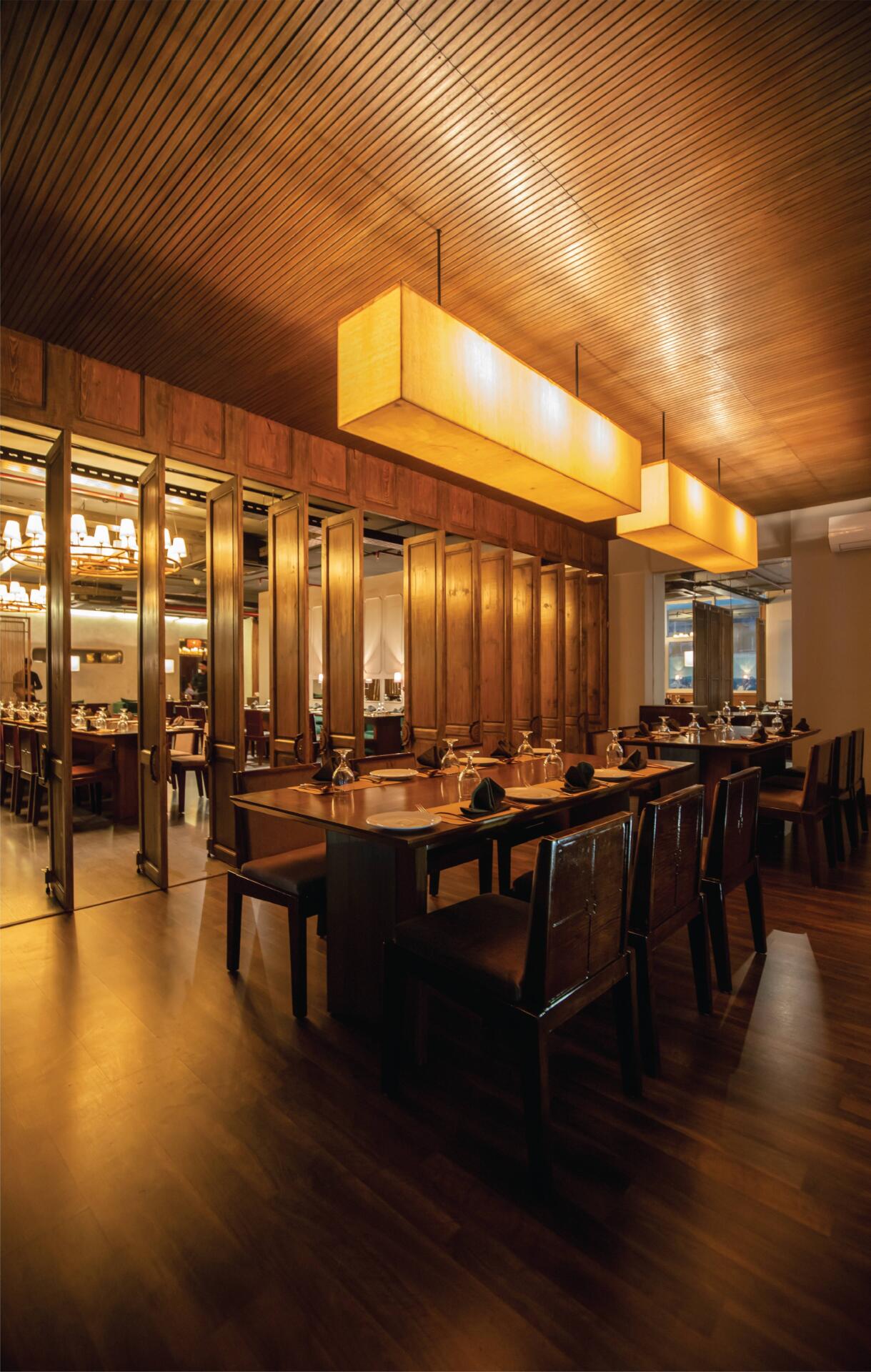
A lantern of ‘Beth and Chatai’ was carefully designed and crafted in the escalator zone near the entry to give passersby and incoming guests a taste of what unfolds inside. The lantern, which was a focal point, was an experimental design by the architect to challenge the bounds of what could be made with flowy waves instead of the traditional circular design. The architect also worked with multiple local artisans to create custom-designed hand-crafted lights and chandeliers made of local materials like cane, wood, bamboo, and beech. The service corridor is lined with basket-shaped hand-woven lamps that lead people into the restaurant. A mix and match of kerosene wood, gorjon wood, and plywood were used to form the wooden elements displayed in the restaurant.
An essential portion of the design was focused on creating a curated colour palette of browns and greens with a touch of grey to avoid having any harsh colours and instead opt for a homogenous, complimentary, soothing colour palette. The earthy tones are further accentuated by using browns that have grey undertones so that the overall output looks well-groomed. Grey texture paint was used to highlight a wall; it includes a chamfered rectangular punch that allows a visual connection with the service corridor.
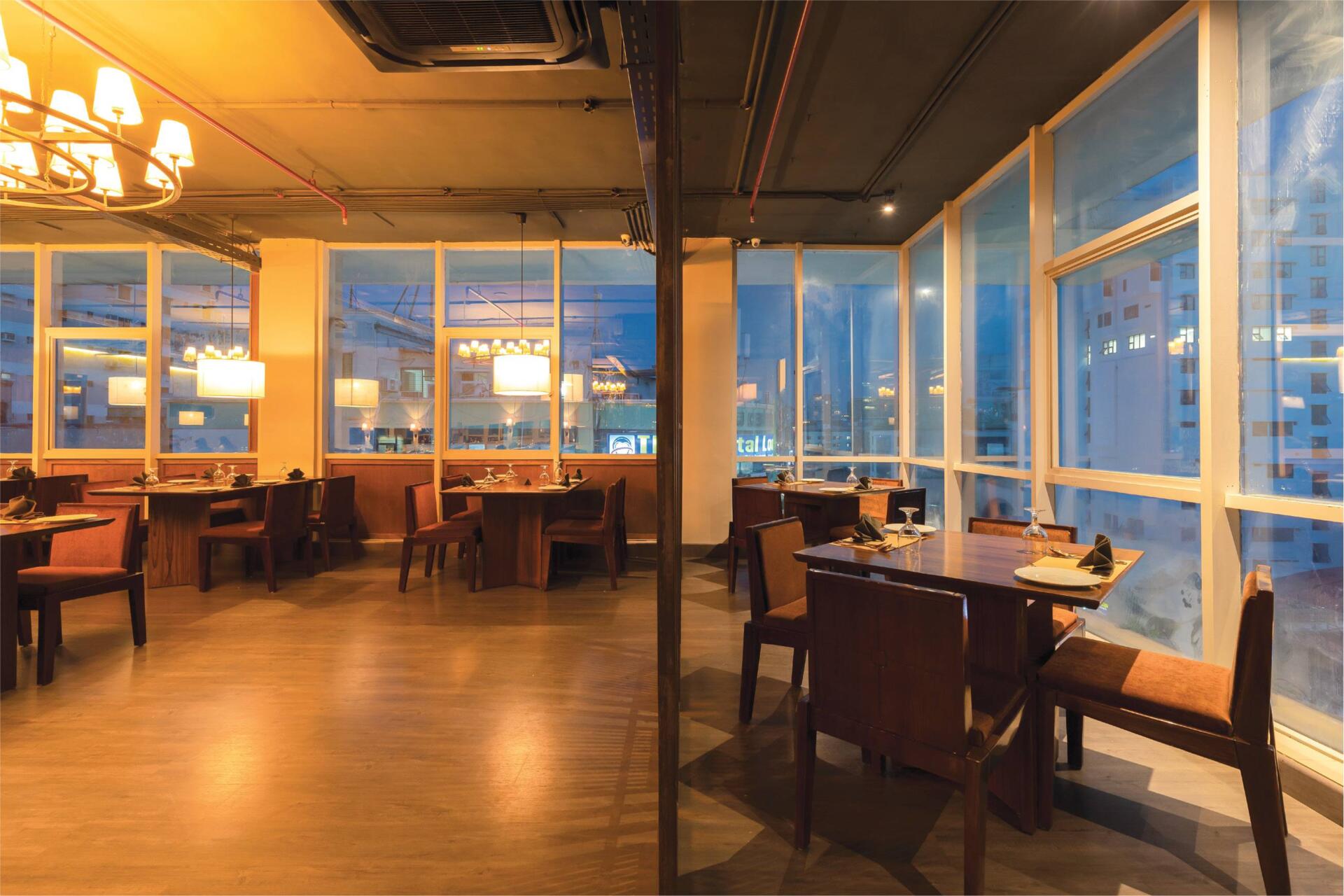
“We decided, deliberately, not to use any blinds on the windows; I want the existing floor-to-ceiling windows to let in ample daylight during the day so that customers can enjoy the sun, and it also gives a spectacular view of the city during the night, “the architect said when asked about keeping the floor-to-ceiling glass windows open. She added that they have not yet had any problems regarding heat gain from the facade.
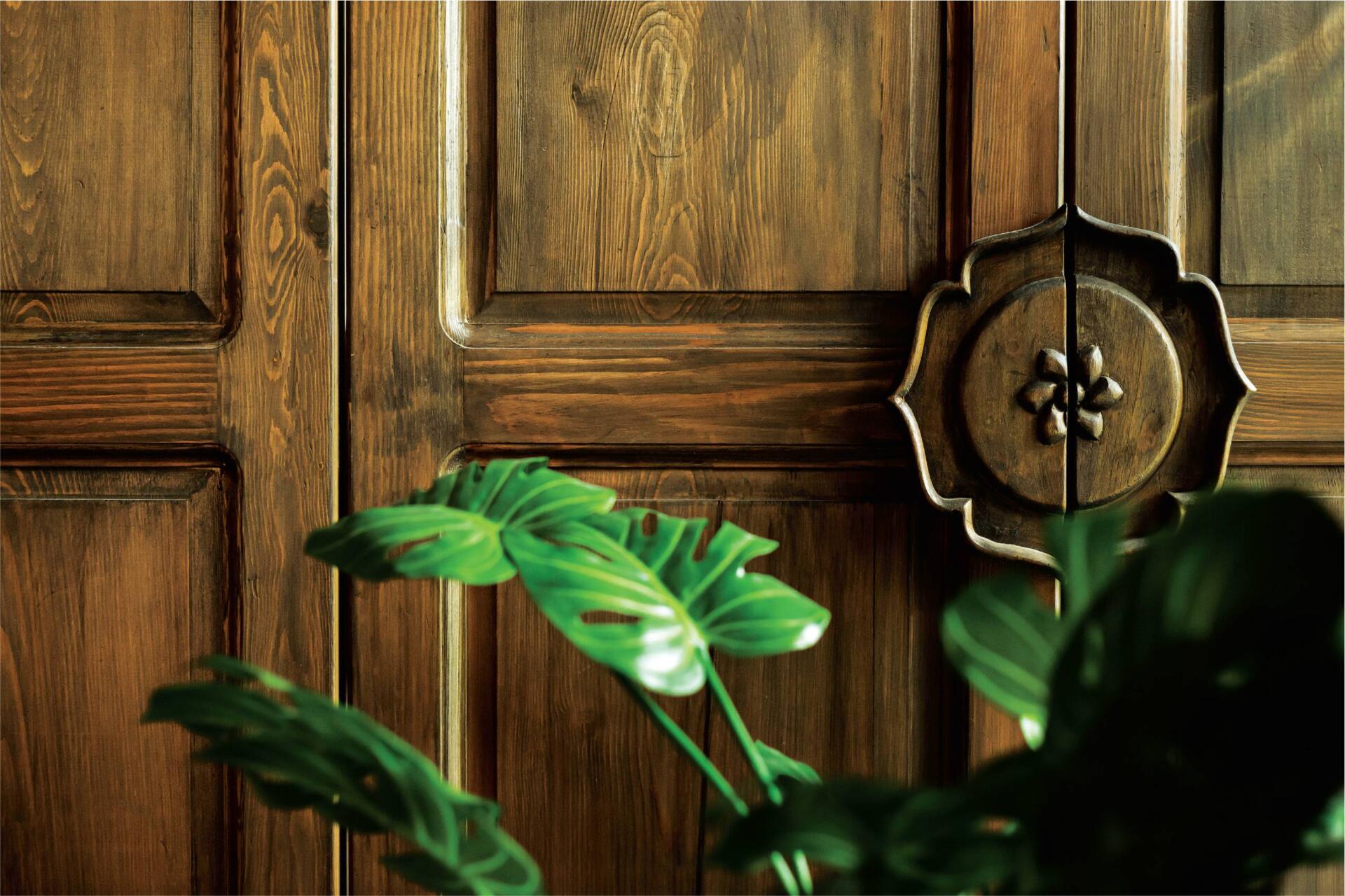
A signature personal style that the architect incorporated into the design was variation in designs of the door knobs used extensively throughout the space. Starting from the door handles of the private rooms, they feature lotus halves, so when closed, they form a full lotus. The door handles were placed much lower than the standard height to create a varied look when all the doors are closed together. The door handles of the restaurant doors have linear wooden handles on glass doors, and the toilet door handles are curved inward to create a unique motif.
The restaurant of Dhanmondi, too, has two entrances to cater to both lifts on opposite sides leading to the restaurant floor, a fact unique to this restaurant. The ceiling is left open to have a modern industrial feel and is painted grey to match the vibe of the restaurant, with only a thin red line of the sprinkler system showing up on the ceiling as a touch of colour in accordance with the building safety regulations.
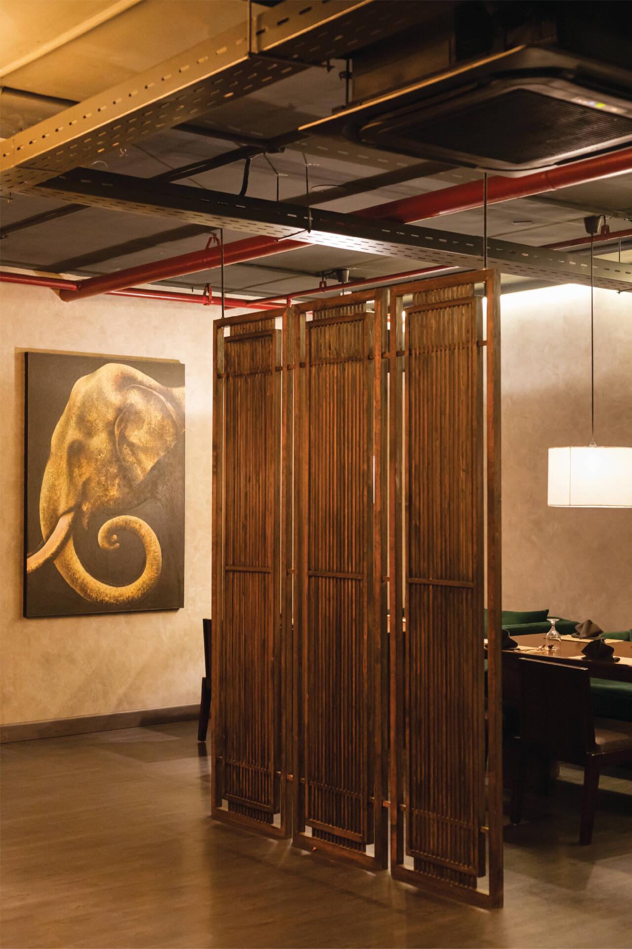
A large painting of an elephant is hung on one of the feature walls as an homage to not only the heritage of the restaurant but also to tie bits of Thai cultural elements into the atmosphere. As you enjoy dinner with a loved one in this bustling restaurant, it is possible to have an immersive Thai food experience with plenty of laughs and an abundance of warmth.


