

INTERIOR INSIGHT
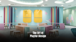
The Art of Playful Design A Look Inside BRAC University’s Child-Centric Sanctuary
A new chapter in early childhood care begins with the opening of the second BRAC University Daycare Centre, located in the vibrant Badda Campus of BRAC University, Dhaka. This thoughtfully designed facility serves as a sanctuary for children up to eight years old, offering a nurturing environment that prioritizes safety and development. Designed by Dwm4 Intrends, with an enchanting lighting scheme from Miro Lighting, the daycare centre is a dynamic and imaginative world where play, learning, and exploration intertwine, creating a joyful space for the children. A Palette of Softness and Imagination The daycare’s core design philosophy is built on a foundation of softness and playfulness. The space is defined by a serene Scandinavian colour palette of pastel shades—soft pinks, blues, and greens—that create a calming and inviting atmosphere. This selection of soft hues was a conscious decision to create a tranquil environment where children feel secure and at ease. Central to the design, this concept is also considered in all edges and volumes and is evident in the custom-made modular furniture, which features rounded edges to prevent bruises and generously cushioned surfaces for comfort. Thoughtful Zoning for a Comfortable Experience The daycare’s layout is thoughtfully divided into two primary zones: public and private. The public zone serves as a welcoming entry point for parents, where mothers can drop off their kids, change their clothes, or feed them. This area features an ergonomically designed washroom with sinks and toilets at child-friendly heights. The private zone is the heart of the daycare. It features a common activity area for all kids—a dynamic space for interaction, play, and learning. Adjacent to this is a sound-insulated nap room, a peaceful sanctuary exclusively for toddlers. This segregated room ensures a quiet and restful environment for sleep, with secure storage above the beds for personal belongings. This approach prioritises the comfort of children while ensuring that parents experience a sense of security and peace of mind. Materials in Design That Engage and Inspire The interiors reflect a calm design approach that is both impressive and functional. The vinyl floors are a durable choice, providing a soft, child-friendly surface that is easy to maintain. The walls are adorned with CNC-cut plywood cutouts that form geometric origami-style animals, such as giraffes and kangaroos, adding a unique texture and depth to the space. A notable feature of interior design is the vertical rock-climbing wall made from panels with child-friendly grips. This equipment helps the young children develop strength through adventurous play and is designed for those aged 4.5 years and older. This interactive design maximises floor space for other activities while promoting physical activity and overall development. When integrating an indoor climbing wall into a playroom, the child’s developmental stages and sensory needs were well-considered to ensure a stimulating and safe environment. Architect Daniel Haque shares, “Children at this age have a lot of curiosity and love to learn from playful shapes, so several playful interactive elements were incorporated in the design.” Overhead, snowflakes on the ceiling and house-shaped shelves on the walls introduce a sense of whimsy and also serve as visual cues to guide children. For hands-on learning, a pair of yellow, popsicle-shaped whiteboards is placed strategically, offering a fun way for children to express their creativity and learn. The pencil-shaped steel columns and child-sized furniture are used throughout the space, including a specially designed sofa that draws inspiration from the iconic “La Mamma” piece near the entrance, scaled down to suit the proportions of young children. The “La Mamma” furniture concept, also known as “Big Mama” or “Donna,” refers to Gaetano Pesce’s Up armchair. This iconic piece, introduced in 1969, is characterised by its distinctive shape and was initially made of foam. The armchair’s design has become a symbol of design and feminism, and a modern design classic. Prioritising Safety in Every Detail Safety was the number one priority throughout the design process. Architect Daniel Haque emphasises, “Special consideration was taken to soften all the edges; there’s no sharp corner here. Every edge has been wrapped with fabric. All switches and sockets are also placed above children’s height so that they can’t access them.” The furniture, floor, and wall materials were all selected with durability and safety in mind, proving that a playful and beautiful design can be achieved without compromising on security. This vibrant daycare was effectively designed by the lead architectural team of Mamnoon M. Chowdhury, Mahmudul Anwar Riyaad, Daniel Haque, and Md. Arifur Rahman. They worked in close association with architects Hasib Rehan and Md. Raduan Ahmed, and the construction was executed by Ar. Arifuzzaman Khan, Engr. Md. Omor Faruque, and Engr. Md. Tareq Rana, to create a practical environment specifically designed to meet the needs of young children. Written By Samira Ahsan
Read More
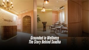
Grounded in Wellness: The Story Behind Svadha
Over the past decade, Bangladesh’s spa and salon culture has gone through a quiet but striking revolution. The once-flashy, first-service catered parlours have given way to curated wellness havens that prioritize experience over gimmicks. From Faux-Thai facades, a new design language is emerging. At the forefront of this transformation is Svadha, the country’s first salon to fully integrate Ayurveda into its core philosophy. But it’s not just their services that set them apart, it’s the atmosphere. Their aesthetic blends the royalty of Mughal architecture with the earthy soul of Marrakesh, creating a space that feels both grounded and luxurious. Svadha is a family-led vision brought to life by Rumjhum Fattah, her brother, Md Golam Rezwan, and sister-in-law, Behtarin Chowdhury Ridma. While the trio has long been a part of Bangladesh’s RMG sector, Svadha marks their first foray into the world of beauty and wellness, and they’re doing it on their terms. The name Svadha, derived from Sanskrit, beautifully translates to “self-care” and “self-love”—an ethos that defines everything the brand stands for. “At Svadha, we’re not here to sell beauty or grooming services,” says Rumjhum. “We’re here to create a space where people can slow down, tune in, and prioritize their well-being.” Svadha is located in the heart of Gulshan Avenue and comprises a total area of around 3300 square feet. The interior, designed by the creative minds at Studio R.A.R., is a visual and sensory ode to stillness, grounding, and mindful indulgence. “Svadha is a true embodiment of peace and tranquillity,” shares co-founder Behtarin Chowdhury Ridma. “From the lounge to the treatment rooms, we wanted every inch to feel like a retreat, where the stress of daily life simply melts away. To achieve that, we explored a palette of earthy tones and tactile, natural materials.” She pointed out that most salons in the city are built around speed and efficiency, often at the expense of comfort. “Everything is so fast-paced—walk in, get the service, walk out. There’s hardly ever a moment to truly unwind,” she reflected. At Svadha, the philosophy is deliberately different. The space is intentionally kept open and airy, avoiding unnecessary partitions or a heavy-handed layout. “We wanted to let the space breathe, just like our clients,” she added. There are no false ceilings or forced divisions; instead, the design embraces fluidity, allowing natural light and movement to flow freely. Catering to working women, Svadha brands itself as a wellness retreat. “Our clients come not just to look good, but to feel good. After long hours at work, they deserve to be unrushed, cared for, and truly pampered.” Drawing inspiration from Moroccan and Indian architectural traditions, the space features intricately carved wooden mirror frames, classic oil lamps, and a striking antique doorway that sets the tone from the moment you enter. A gentle water fountain hums in the background, further enhancing the atmosphere of calm. “We wanted to infuse the space with elements of nature and its calming rhythms,” shared Rumjhum. “The water fountain, placed thoughtfully within the layout, is a quiet homage to that intention, a gentle nod to movement and serenity. Throughout the space, you will find indoor plants too” Lighting, too, was carefully curated to complement this ambiance. There’s a deliberate avoidance of harsh, bright lights. Most areas are bathed in soft, ambient illumination, dimmed and mellow to encourage relaxation. However, in zones like the makeup and hair stations, where precision is key, the lighting is thoughtfully intensified to ensure clarity without disrupting the overall calm. One of the standout features of the salon is the textured wall next to the reception where the metal brand name is hung. There is also a graffiti wall, commissioned by a Fine Art student of Dhaka University where Mughal-themed flowers are painted. Every piece of furniture in the salon has been custom-crafted in-house. Each zone has been thoughtfully planned to serve its specific purpose, whether it’s a quiet waiting lounge, a private treatment room, or a styling station. Every detail, down to the custom-built furniture, typography on the walls, and curated lighting reflects Svadha’s vision of a wellness destination that feels both intimate and elegant. Written by Kaniz F Supriya
Read More
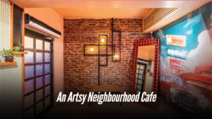
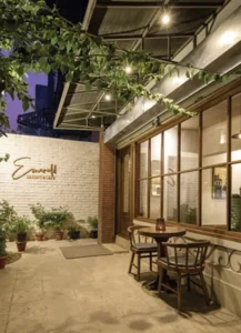
You Actually Want to Hang Out in! Brutown’s Got a Funky New Friend: Say Hello to Nervosa.
For those who enjoy café culture, a delightful spot has opened its doors to Dhaka’s vibrant crowd. Nervosa is a cafe located on Siddheswari Road, Dhaka, at the edge of a bustling neighbourhood—just above Brutown, which has long been a favorite in the heart of Bailey Road. Why Nervosa The name, “Nervosa,” is a deliberate nod to the beloved sitcom Frasier, where a fictional coffee shop of the same name served as a backdrop for the characters’ daily lives. Sabeel Rahman, CEO and Proprietor of BruTown and Nervosa, explains his choice with a playful intrigue: “The question of ‘Why Nervosa?’ is what makes it captivating. It draws attention, it’s a memorable name.” Consider Nervosa as the upscale, fancy, artistic neighbor of the popular cafe, BruTown, finding its niche in the community. Behind the Scenes Rehnuma Tasnim Sheefa, the principal architect of Parti.studio elaborates on the design philosophy: “Every design develops from a concept or a vision and if for a restaurant or a cafe, the branding has its influence as well. For Nervosa, that concept was built on strong character and a vibrant color palette, designed to draw a younger crowd into the cafe, as envisioned by the owner. When working in a public realm like cafes, as an architect I also had to focus on the psychological impact a person would have with the colors and the characters.” The color palette evolved gradually. Pale Orange took precedence, aligning with the theme initially, with striking illustrations bringing life to the walls. To make the illustrations stand out, a monochrome backdrop was introduced for the floors, ceilings, and other walls, allowing the boldly patterned and colored furniture to shine truly. The exposed brick on some of the walls adds a touch of urban grit, while the wooden flooring brings warmth and texture; keeping them aligned with the basic pale orange color. The cafe culture in Dhaka thrives on connection. Comfortable seating arrangements encourage heartfelt conversations, from an upcycled plush couch perfect for intimate gatherings to communal tables fostering spontaneous interactions. Nervosa goes a step further with cozy bookshelves stocked with comics and novels, perfect for anyone who wants to settle in with a good read. Instagrammable Spots Several strategically placed elements aim to create visually captivating ‘Instagrammable’ moments. The journey begins at the entry staircase, where a whimsical illustration introduces the cafe’s personality. Upon entering, a prominent neon light sign immediately catches the eye. Inside, a one-of-a-kind waffle mirror greets you at the entrance for your mirror selfies with your friends. Track lights are incorporated here to highlight specific areas, making them ideal for photos. “You will also find the neon lights in different spots around the cafe”, shares Architect Sheefa. The use of neon lights is an interior design trend in restaurants targeting younger crowds, particularly Gen Z. They create a visually appealing and Instagram-worthy atmosphere, making restaurants more attractive to social media-conscious customers, to create a unique and memorable visual experience. illustrations that speak to you To add character to the interiors, the beams and walls are filled with vibrant illustrations. In the beam above the counter, the illustrated characters resemble the target audience of the cafe, and how they interact and behave. Describing the artworks, Mashqurur Sabri, the artist, shares, “Nervosa walls are a burst of young energy and Dhaka madness — messy, loud, and full of heart. The hand-drawn, sketchy art style mixes raw lines with pops of bold, chaotic color — think warm reds, electric yellows, moody teals — capturing the city’s wild rhythm. From buzzing rickshaws to rooftop chill scenes, it’s the city on caffeine — vibrant, warm, and wide awake.” “When I think of Nervosa as perceived by the public, I wish it to be known as the most happening place in Siddeshwari,” says the owner, Sabeel Rahman. The vibrant interior, the playful name, and the strategic use of social media-friendly elements all point to a well-thought-out strategy. Nervosa isn’t just serving coffee; it’s serving an experience. And if the initial buzz is anything to go by, it’s an experience that Dhaka’s café-goers are eager to embrace. Written by Samira Ahsan
Read More
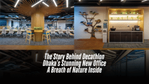
The Story Behind Decathlon Dhaka’s Stunning New Office
In the center of Dhaka’s relentless urban sprawl, Decathlon’s new liaison office has carved out an unexpected oasis. Designed by Studio one zero, the two-floor, 20,000-square-foot workspace is a lively yet calming blend of nature, sport, and smart design — a triumph achieved under the intense pressure of a compressed timeline. One floor of the office is devoted to a sprawling seminar and multi-purpose event space, while the other flourishes as a vibrant open-plan workspace. Together, they embody Decathlon’s global brand ethos: movement, accessibility, and connection to the environment. From the first step inside, the design immediately surprises. Natural light pours in from every angle, with open workstations, informal seating zones, and collaborative spaces stretching toward the glass walls. But what truly distinguishes the space is its deliberate, sensitive incorporation of natural elements into an otherwise urban setting — a concept that chief architect Jafor Hoq and Partner Architect Humaira Binte Hannan at Studio One Zero were determined to bring alive. Challenge Against Time “The biggest challenge for us,” says Jafor Hoq, “was the design decision against time. From the initial concept to execution, we had a very short period. And it wasn’t just about filling a space — Decathlon wanted something meaningful, experiential, and true to their brand spirit.” Working under intense deadlines and changes meant that decisions on materials, layouts, and designs had to be made rapidly but thoughtfully. “We had no time for second-guessing. Every material, every design move had to be purposeful and achievable within the timeframe,” Hoq recalls. Instead of battling the constraint, Studio one zero leaned into it, focusing on a few strong ideas and executing them meticulously. Bringing Nature Indoors — A Different Way While biophilic design is no longer a novelty, Studio one zero’s approach for Decathlon’s office is refreshingly nuanced. Instead of merely placing potted plants in corners, nature was embedded into the structure itself. The most striking feature — the tree-inspired columns — originated from a need to solve a technical problem with artistic flair. Existing structural columns, often seen as obstacles in open-plan offices, were transformed into vertical wooden sculptures. “These columns are not just cladded structures,” Hoq explains. “We intentionally gave them the form of large tree trunks, expanding outward at the top, creating a canopy-like feeling. Under these ‘trees,’ we placed high seating zones, making them natural gathering points where people can sit, stand, and connect. It’s about reinterpreting indoor nature — not just bringing in greenery but evoking the experience of being under a tree.” Materiality: Warmth in an Industrial Frame The material palette reflects a thoughtful balance between modernity and warmth. Light oak wood cladding runs through the flooring of common pathways and wraps around key architectural elements, providing a sense of warmth and continuity. “The idea was to humanize the space,” says Hoq. “We were working with an exposed ceiling — which gives that industrial look — but we didn’t want it to feel cold or impersonal. Using wood, texture and incorporating green , was the answer.” Meanwhile, the furniture choices favored light-colored wood and clean lines to complement the architecture without overwhelming it. Lush green walls filled with planters further softened the industrial base, offering breathing spaces that look and feel alive. Even the lighting played into the natural narrative. Angular, dynamic geometric light fixtures, seemingly random yet deliberate, mimic dappled sunlight filtering through tree canopies, casting a playful rhythm of light and shadow across the workspace. Functionality at the Core Of course, Decathlon’s office needed to be more than beautiful; it needed to work. Beyond the seminar space and open workstations, Studio One Zero integrated a variety of amenities including a gym, prayer rooms, a sick room, and a restaurant-style café. The café, with its relaxed seating and natural materials, encourages casual interaction — a deliberate attempt to break down formalities and foster an easy, collaborative culture. Flooring materials shift subtly from wood to textured carpet tiles to indicate different zones without physical barriers, preserving the openness. Every design choice speaks to movement, flexibility, openness and wellness — values at the heart of both Decathlon and Studio one zero’s architectural philosophy. A Space That Moves People In the end, Decathlon’s Dhaka office is more than a workplace. It’s a living, breathing environment, where the boundaries between indoor and outdoor, formal and informal, structured and free-flowing, are beautifully blurred. Studio One Zero’s bold vision — executed under a limited timeframe — has resulted in a space that isn’t just seen; it’s felt. A place where employees can experience the spirit of sport, the calm of nature, and the excitement of innovation, every single day. “We didn’t just design an office,” Jafor Hoq smiles. “We designed an experience.” Written By Fatima Nujhat Quaderi Photo: Truphoto Studio
Read More
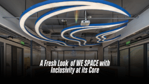
A Fresh Look of WE SPACE with Inclusivity at its Core
In the bustling Gulshan North Avenue of Dhaka, a unique office concept in Bangladesh replaces traditional departmental segregation and hierarchy with freedom of workspace and teamwork. Located in a prime location of Dhaka’s business hub, WE SPACE is Woolworth’s Group’s Bangladesh office, co mprising an area of 6,300 square feet. The entire project was completed in 90 days, which was a challenge in itself. The spaces in this project have been designed with Woolworth’s inclusive concept of “WE” and togetherness in mind. This concept is reflected in the layout, flexible workspaces for users, and an interesting colour palette that complements the brand identity. As per the question, Sudeshna Shireen Chowdhury, the founder and principal architect of Studio.O, explained, “All functions are arranged together in a loop. If you enter the office from one side, you can come back and end up in the same space.” Inspired by the concept of “We Space,” the layout has been developed with a central collaborative social hub and town hall space as the heart of the office. Upon entering, a clean, central circulation spine welcomes the user into the space. This loop leads them towards designated zones, which are specifically marked to enable easy navigation. The design ensures universal access for both circulation and entry into all spaces, promoting proper orientation and mobility. Overall, the office space has been designed to be exceptionally user-friendly, showcasing unique details and features while upholding the brand identity of Woolworth’s Group. Architect Sudeshna explains that there are no designated seats or fixed workstations. The concept is for all functions to be connected in a loop, allowing users to enter from one side and return to the same space upon exiting the loop. The design team did not introduce a traditional reception area, as the other Woolworth’s offices do not have one either. The zoning prioritises common areas, meeting rooms, and a multifunctional room near the entrance for guests. The kitchen, designed more like a coffee pantry, is also placed near the entrance for easy access by guests. Public spaces are readily accessible upon entering the office. “As you move further inside, you’ll find the workspaces located near the terrace space,” as explained by Architect Sudeshna. All the furniture for this project has been locally sourced and designed, making it exclusive to the users and the office. Hatil provides modern, space-saving compactor storage that allows for a significant amount of storage within smaller areas. Height-adjustable tables and workstations were made locally using handmade techniques. The vibrant colour palette within the workstations incorporates orange and green shades. A unique feature is the collaborative table they designed. It can function as a whole table for four people or unfold into individual workspaces. One of the most striking features of the space is the ceiling. The Woolworth’s logo is cleverly incorporated as a ceiling light fixture, adding a unique and memorable touch to the ambiance. The clients loved this detail and are considering replicating it in our other branches to create a consistent and memorable brand experience. Vinyl flooring is used throughout the space, with a colour scheme that complements the blue ceiling light to further highlight the blue colour in the ceiling and the brand association as well. No partitions were used in open spaces; the variation in the texture of the floor materials separates the zones. Biophilic principles were considered throughout the design process. Planters were strategically placed to integrate nature into the workspace. The architect adds, “We always consider biophilic principles. So, we planned where the planters would go and designed accordingly.” The meeting room features a TV panel that doubles as a whiteboard, demonstrating a smart design element. Acoustics were also a priority. To minimise echo, a false ceiling with sound-absorbing panels was installed. Carpets were also used for the same purpose. In the main workspaces with exposed ceilings where talks and town hall meetings are held, sound-absorbing carpet flooring was used. Another unique addition to the project was the soundproof office pods for four people. “These pods are fully furnished, offer 85% sound absorption, and have their own ventilation systems,” explains Architect Sudeshna. She further adds, “Every space has its own identity. There is a focus zone, a collaborative zone, and a social zone, all with different kinds of identities and characters.” Completed in January 2023, WE SPACE is a collaborative project by the eminent architecture firms Studio.O and Binyash, located in Dhaka. The team of architects brainstormed together to come up with a concept that ensures efficiency, comfort, and a positive ambiance for office users. Architect Sudeshna Shireen Chowdhury concludes, “Working with the Woolworths team was an exceptional experience. We appreciate the unparalleled support from our partners.”
Read More
A Journey Of a Thai Culinary Excellence of and Artistic Innovation
We are sure that there are times when you crave some good tangy Thai flavours and also miss the vibrant experience of street life in Thailand. Naming from the famous street of Bangkok, Khao San is such a place where you can meet both. Founded by four friends – Bushra Haque Sarah, Syed Sameem Shahriyar, Taposh Ghosh, and Mustafid Raiyan Khan—Khao San is more than just a dining spot; it’s a passion project. After gaining popularity in Dhanmondi, Khao San has now made its mark in the heart of Gulshan. Despite being open for only a few months, the restaurant has already captured the hearts of diners with its delectable taste and unique interior. With the air infused with tantalising Thai flavours and the atmosphere adorned with bold hues with a pinch of earthy colours, the restaurant interior pays an ode to its famous Thai street namesake, Khao San Road. As guests step into this new branch, they might subconsciously reminisce about the interior of Dhanmondi and immediately be enveloped in a newer enchantment. The restaurant not only draws its name from the famous road but also matches the vibes of the lively and bustling area renowned for its vibrant nightlife and dynamic energy. Through careful design interventions, the restaurant’s interior captures this spirited ambiance, blending the bustling vibe of Khao San Road with a serene touch of nature. We designed Khao San Gulshan with the Dhanmondi branch in mind. We tried to maintain a similar essence,” said Sheefa. Like the debut branch, the interior has been done by Rahnuma Tasnim Sheefa, the principal architect of Parti.Studio. Once you’re inside Khao San Gulshan, you will consciously notice the wooden motifs on the main door, inspired by the lotus flowers of Thailand. The same motif is also reflected in the door knobs of washrooms and a partition door, creating a cohesive design throughout the space. The designer has carefully merged the wooden motifs with the glass, creating a screening that added a modern touch to the usual traditional design element. Upon entering the space, you will be greeted by a vibrant, real tuk-tuk. The dining area is mostly an open plan divided into several zones that are connected visually yet spaced out with mesh dividers and plants. There’s also a private room for larger groups. One of the seating zones features an elevated floor space where you will discover a wall composed of a wooden window with a stunning mural painted inside and designed beside a rustic doorframe. As the architect described, the entire space is very “instagrammable.”. You will find corners or elements to take dope pictures. With splashes of vibrant hues, warm tones, and moody ambient lighting, each nook and cranny has been designed to capture the eyes of the visitors, inviting them to take a closer look and explore the decor. The restaurant design mimics the scenic nature and happening city life of Thailand, interpreted to fit into the theme. Through closer inspection, you will be able to decipher that the city-influenced part of the restaurant has warm tones of orange, red, and yellow. On the other side, the nature part has an upper hand with cool tones of blues and greens. “Throughout the space, we introduced natural plants to keep the nature found. On a wall, you will find a huge illustration with an elephant, which is a vital character from the branding. The story goes like the elephant, after exploring the city, is moving from city to jungle,” added Sheefa. To keep up with the traditions of murals in the Khao San restaurants, the architect had to face some challenges. In the Dhanmondi branch of Khao San, you will find hand-painted murals; however, due to the building’s age and damp walls, hand-painting wasn’t feasible in the Gulshan branch. As a creative solution, Sheefa introduced illustration murals in sticker format, ensuring the same artistic touch while overcoming the challenges posed by the building’s condition. The amazing representation of the ideas was displayed in the form of illustrations by Mashqurur Belal Sabri. The architect took special care to include the implementation of our local craftsmen. All the furniture used in the restaurant is designed and crafted by local artisans. The decorative items, including the metal hanging lights, are also customised and locally made. One of the major setbacks of the restaurant space was its ceiling height, which is quite lower than the average. As a result, a false ceiling was barely an option. “Though I highly oppose using false ceilings, but at rare times when necessary for concealing wiring, considering the already limited height of the ceiling, installing them would only make the space feel cramped and claustrophobic. Therefore, we minimised the use of false ceilings and chose grid wiring in the original ceiling,” explained Sheefa. The architect designed the wiring grids on the original ceiling very innovatively. Some of the grids are functional; a few are added only to make the grid design complete. The decorative items are hung carefully, keeping careful alignment with the grids. The ACs have been camouflaged very interestingly, merged with the backgrounds, allowing the murals to flow seamlessly through the space without interruptions. The murals are very artistic, reflecting the hustle and bustle of Thai city life and its nature. Within a few months of its operation, the restaurant gained unparalleled popularity in the area and is mostly packed to capacity during the peak meal hours. The vibrant and colourful décor with artsy and picturesque style combined with affordable yet authentic Thai cuisine beckons customers from far and near to Khao San to enjoy a truly enjoyable gastronomic experience. Written By Kaniz F Supriya & Quazi Anika Afrin
Read More

Basking in Rome’s Sun In Dhaka
Residing in a quiet corner in Dhaka’s Gulshan area, one can find a mini-Europe as soon as s/he spots Raffinato. “Raffinato Ristorante Italiano” – just by seeing the name, one can already sense its Italian essence. At the first glance, I noticed a cozy, two-story white house with an L-shaped stairway leading to a small balcony, which gave more of a European home vibe.
Read More
An ode to a bold architectural narrative The New Travel East Restaurant
At the heart of any remarkable restaurant lies its design—a subjective blend of form and function. The design itself becomes a storyteller, weaving narratives of contemporary tradition. The walls, the textures, the colours—they all tell a story.
Read More
A Look Inside the Vibrant World the Potato Digital Office
Designed by architects Sanzid Iqbal Rizvee and Rubayet Ferdous, construction for the Potato Digital Office commenced in May 2022 and was successfully inaugurated in June 2022. Remarkably, within a brief period of 45 days, the team efficiently designed and executed the vibrant space at their new Gulshan branch. Soon, the office turned out to be the talk of the town.
Read More
Thai Emerald Dhaka A Myriad Of Browns And Blended Greens
It’s a cosy Thai restaurant that transports one into the cultures and feels of Thailand through its rustic approach and earthy colour palette. So, be prepared to feel the vibes of Thailand and enjoy the warm atmosphere with a great dining experience. Most people know Thai Emerald as a go-to place to enjoy good Thai cuisine. Since its inception in 2012, Thai Emerald has strived to bring the flavours of Thailand to Dhaka – from Uttara to Gulshan to Dhanmondi – through its design and food. It has progressed over the years. Architect Rafia said their goal was to reflect the food served and the geographical setting of the restaurant while making the design. During the design of this restaurant, she used furniture and earthy tones similar to what she did with other restaurants to connect the brand and have a sense of reconciliation with the other two restaurants in town. A few of the dining chairs and the reception table and cash counter with the lotus motifs were elements that she had replicated to harmonise it with its predecessors. The wooden blocks situated on the backdrop of the cash counter pay homage to the second branch of Thai Emerald situated in Gulshan. The space was designed with efforts to keep the restaurant spacious to better accommodate large groups of people that frequent the restaurant. This was further highlighted by creating soft visual partitions through perforated separators or more solid partitions that allow big groups to co-exist with individuals or small groups while dining simultaneously. The architect wanted the diners to have elements to explore while dining at the restaurant – large cluster of doors separating private rooms, mirrored backdrops, or lamps hanging from the walls. The diners would have unique visual characteristics to ponder. She envisioned that people should be able to properly enjoy their time there. Thus, her goal was to create a warm, inviting ambiance with a play of dimmed, hand-crafted lights and splashes of earthy tones to create a soothing, delightful atmosphere for the customers. A focal element for this particular restaurant would be the doors, enclosing the private rooms, designed to be a point of attraction. “The reflection of Thailand is brought in through elements; for example, the lotus motifs in the door handles are a direct reflection. If you see Thai design, you’ll notice the use of softer lines rather than harsh straight lines, which have been reflected in the use of curved lines in the door details with softer, rounded edges,” the architect explains. Designing the small doors and playing around with the depth and lines was an interesting element that she loved when working on the restaurant. The architect wanted the doors to intrigue onlookers instead of having a dead space with boring partitions. In keeping with modern, contemporary design, the perforated partitions are made of sleek frames and thin lines to have a stylish outlook. A lantern of ‘Beth and Chatai’ was carefully designed and crafted in the escalator zone near the entry to give passersby and incoming guests a taste of what unfolds inside. The lantern, which was a focal point, was an experimental design by the architect to challenge the bounds of what could be made with flowy waves instead of the traditional circular design. The architect also worked with multiple local artisans to create custom-designed hand-crafted lights and chandeliers made of local materials like cane, wood, bamboo, and beech. The service corridor is lined with basket-shaped hand-woven lamps that lead people into the restaurant. A mix and match of kerosene wood, gorjon wood, and plywood were used to form the wooden elements displayed in the restaurant. An essential portion of the design was focused on creating a curated colour palette of browns and greens with a touch of grey to avoid having any harsh colours and instead opt for a homogenous, complimentary, soothing colour palette. The earthy tones are further accentuated by using browns that have grey undertones so that the overall output looks well-groomed. Grey texture paint was used to highlight a wall; it includes a chamfered rectangular punch that allows a visual connection with the service corridor. “We decided, deliberately, not to use any blinds on the windows; I want the existing floor-to-ceiling windows to let in ample daylight during the day so that customers can enjoy the sun, and it also gives a spectacular view of the city during the night, “the architect said when asked about keeping the floor-to-ceiling glass windows open. She added that they have not yet had any problems regarding heat gain from the facade. A signature personal style that the architect incorporated into the design was variation in designs of the door knobs used extensively throughout the space. Starting from the door handles of the private rooms, they feature lotus halves, so when closed, they form a full lotus. The door handles were placed much lower than the standard height to create a varied look when all the doors are closed together. The door handles of the restaurant doors have linear wooden handles on glass doors, and the toilet door handles are curved inward to create a unique motif. The restaurant of Dhanmondi, too, has two entrances to cater to both lifts on opposite sides leading to the restaurant floor, a fact unique to this restaurant. The ceiling is left open to have a modern industrial feel and is painted grey to match the vibe of the restaurant, with only a thin red line of the sprinkler system showing up on the ceiling as a touch of colour in accordance with the building safety regulations. A large painting of an elephant is hung on one of the feature walls as an homage to not only the heritage of the restaurant but also to tie bits of Thai cultural elements into the atmosphere. As you enjoy dinner with a loved one in this bustling restaurant, it is possible to have an immersive Thai food experience with plenty of laughs and
Read More
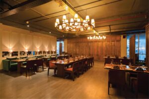
SUSHI TEI Experience Tranquillity with Authentic Japanese Taste
If you’re in the mood for a sublime space and Japanese cuisine, Sushi Tei is the place. Sushi Tei interior aspires to a state of harmony, serenity, and simplicity. Clean lines, uncluttered areas, and a minimalist approach are used in the design to foster a serene mood. Popular Japanese restaurant chain Sushi Tei is known for its sushi and other Japanese cuisine. It began its journey in Singapore and has since spread to several Asian nations including Bangladesh. In 1994, it was opened in Singapore and in Bangladesh it’s first introduced in 2020 at Gulshan, Dhaka. The interior reflects Japanese culture’s Zen Garden idea. recognising and praising the genuine shape and colour that permeated the entire area. A sturdy Keora tree root sculpture stands out at the entrance. A component of nature, yet in its unaltered, unadulterated state, it exudes a unique aesthetic appeal. On the exterior, the GP sheet and MS sheet sculpture blend with the creepers, creating a green facade. The transition from the outside to the inside is thoughtfully planned. At the entryway, a zen garden is included to go with the wooden pavers. A large waiting area is available at the reception desk on the ground floor to welcome visitors. The first floor is where the restaurant is. The staircase’s Tuna fish sculptures on the wall and the north-diffused light from the opening offer visitors a sense of calmness. The entire experience—from the outside to the inside—is a voyage into meditation. “It’s pretty difficult to convert a residential property into a restaurant space. I liked the entire area as there were a lot of space and trees surrounding the structure. The obstacles we experienced served as the inspiration for every design choice,” explains the interior designer and artist Md. Mazharul Haque Tonmoy. “It had an issue with water clogging since the surface in the area was lower than the road. To address that, we included soak-able green areas, which allowed us to design an outdoor zen garden.” The restaurant’s aesthetics favour a subdued and neutral colour scheme. Earthy tones such as beige, cream, soft greys, and muted greens have been used to create a calm and soothing atmosphere. The focus is on functionality and creating a sense of spaciousness. The use of natural materials is remarkable. Wood, bamboo, stone, and natural fibres like cotton are incorporated into the restaurant’s interior. Exposed wooden beams, bamboo partitions, and stone accents create a sense of warmth and authenticity. Sushi Tei’s interior emphasizes open spaces and a sense of flow. The layout of the restaurant allows a smooth transition between different areas. Open floor plans, sliding doors, and screens are used to create flexible spaces that can be adapted for different group sizes or private dining options. It’s fascinating how different types of floor materials are used to separate spaces. To accommodate various visitor demands, various sitting configurations, including booth seating, low-height seating, and Takumi seats, have been implemented. Gentle and warm lighting played a crucial role in this Zen-inspired restaurant. Soft, diffused lighting fixtures like pendant lights, paper lanterns, and wall sconces have been used to create a tranquil atmosphere. While the space is designed as a low-light space, maximising natural light through large windows or skylights is also incorporated to establish a connection with the outside world. Incorporating Japanese artwork, calligraphy, or traditional motifs enhanced the Zen aesthetic. Hanging scrolls (kakemono) with brush paintings, ink wash paintings (sumi-e) and carefully selected artwork provide focal points and add cultural depth to the space. The acoustics of a dining area are crucial to its ambiance. The soft trickling of fountains and running water is now present. The ambient noise was softened with the help of a miniature indoor fountain. To add a touch of nature and artistry, Sushi Tei’s zen garden displays bonsai trees. These meticulously crafted arrangements reflect the Japanese appreciation for beauty and harmony in nature. The entirety of the setting is ideal for taking photos. The use of mirrors and glasses is fascinating. “The Japanese are very sensitive about their design. The patterns they use on their screens are also very detailed. We tried to follow their process of design, not a specific design. The philosophy was to let the space speak for itself about how it wanted to be treated. We were just trying to listen,” Md. Mazharul Haque Tonmoy added. Sushi Tei, provides an oasis of calm for guests, allowing them to relax, unwind, and appreciate the simplicity and beauty of their surroundings while enjoying their dining experience. Written by Fatima Nujhat Quaderi
Read More
O’Play A playful combination of colours and spaces
Imagine being able to spend a peaceful evening with your loved ones in the middle of Dhaka’s hectic city life, where indoor and outdoor areas flow together to form a kid-friendly environment. And now, in O’play, it’s all come to life.
Read More
Tradition Wrapped In Modernity: Terracotta Tales
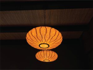
In the fast-moving pace of Dhaka city, do we not all feel the need to slow down, away from the chaos, experience the presence of the surroundings, and stay in the moment? Inside the premises of the Tejgaon branch of Aarong, Terracotta Tales pays homage to the local craftsmanship. It is a place dedicated to the warm and sentimental dishes and the comforting and heartfelt ambiance that make us long for home. Rafia Mariam Ahmed, principal architect of Hive Architects, designed this beautiful restaurant having intimate dialects with details. When an individual experiences space, what does make one recall it? What works there is the phrase: “design is in the details.” The goal of embracing details is to get you to think critically and present the best possible solution —right from the beginning. That is why details are important. They can keep us coming back, or they can keep us from coming back. And definitely, that comes from a good number of researches. Terracotta Tales is one such location where traditional village home details are infused into a minimal modern portrayal. Terracotta Tales and the adjacent bakery, Dough Diaries, are in a joint venture with Aarong. They are one of the restaurants under the Emerald Restaurants, with other operational restaurants being: Thai Emerald, The Red Chamber, Grove, Trouvaille, Gusto, and Emerald Bakery. The structure the restaurant belongs to was initially designed by Vitti Sthapati Brindo Ltd. alongside the Aarong outlet. The outlook of the structure, starting from the large openings, landscape, and interior to the detailed texture on the outer surface – all were later added as the journey of designing this tale began. The theme and menu of the tale were to be Bengali cuisine, from where conceptualisation of the space began. “I started going back to our roots of being a Bengali. I wanted to pick the elements so rich with history, which had been used daily in our culture, for so many years, and blend these elements with modernity. I wanted to design a space that would take us back to where we belong, a place more oriented towards slow living,” Ms Rafia shared. The space is an abstract representation of a mud house, the softness of which is found in the details of rounded corners of walls, doors, and windows. The unevenly matte polished surfaces with raw, warm earthy colours take you to the affection of the rural aura. Even at night, the lighting is as such to create the ambiance of a warm-toned hue of “prodeep” (dimmed fire lamp). The centre light pieces are delicately handwoven cane shades. Terracotta has been used in many details of this space. In the shade of the walkway, with that of the semi-outdoor space on the rooftop, and the centre of attraction is the wall of the stairway that leads to the rooftop dining. The wall is composed of thin slates of terracotta tiles arranged in triangular patterns, which creates dialects with the light from the sky at different hours of the day. The lanterns used in the rooftop space are also custom-made of burnt clay. As clay is a vital component of humans, country, and roots, the concept and name were associated with terracotta to represent its power of affection. Tales of local artists and craftsmen were incorporated into the design by the use of cane lanterns and clay lamp shades and the famous “Tepa Putul” (a local handmade clay doll of a specific style). Potters and artists made larger sizes of these usual small-scale dolls that are placed on niches as commonly seen in the mud houses. Framed rustic metal jewelry and decorative mirror are added to the wall to represent the daily used materials in a rural mud house. The landscape is designed to wrap an individual with nature. The restaurant is pedestrian-only, with no vehicular connectivity directly, focusing on the practice of being close to nature. The walkway has a beautiful line of bamboo trees on one side and specifically selected floral trees on the other. There is also an outdoor sitting area where the hard surface meets the green in an undulating line. A small body of water curves along the structure is an abstract form of “pukur” (a pond) as commonly seen in the rural context. Ms Rafia said, “The mere attempt was to get out of the edged effect of modern city life to a more mellow and soulful experience – Where one can only indulge in the presence of themselves, the company, and, of course, the food. The trees shed flowers and leaves, creating an inviting bed of nature for the people exploring the outdoors. The curved walkways toward Dough Dairies also give you a feel of the rural memories.” The subconscious nostalgia with the cane-woven furniture details makes one reminisce childhood memories from the ancestral homes. The utility area has been partitioned with cane-weaved partitions to camouflage it in the interior. The wooden curtain rails and the door handles add value to the theme, complementing the colour palette. A few subtle colours are added by using a floral print material on the back of the seats, preventing the guests from feeling monotonous. Old ceramic plates are decorated on the wall, making a spectacular composition of colours, history, and belongingness. On a bright sunny afternoon, when the sun kisses the shallow water next to the large window with curtains of translucent softness, the sheening glitter of the rippling water reflecting on the ceiling catches one’s attention while being indulged in the nostalgic local cuisine. The soul runs through the handcrafted details and the softness of the ambiance makes one feel warm, cozy, and at home. The modern city crowd is so much more over-oriented towards a captivated lifestyle that even a natural splash of water becomes a form of irritation. Terracotta Tales is a space to celebrate that naturally unnatural necessity of life that people are slowly getting carried away from. Authored by Rehnuma Tasnim Sheefa
Read More
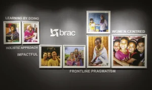
Balancing Work and Tranquility Brac International Headquarters
With changing generations, the working culture along with its surrounding environment is evolving. As employees’ lifestyles become more comfortable, there is a greater demand for modern work life and space. One such example is the newly renovated headquarters of BRAC International. The office on the 14th level of the BRAC Centre is an exception in itself. BRAC International is an international nonprofit organisation that works to empower individuals and communities affected by poverty, illiteracy, diseases, and social injustice. BRAC’s institutional expertise has successfully implemented programmes across 10 countries in Asia and Africa, impacting the lives of over 100 million people by adapting the models according to the context of the specific country. As an international nonprofit, BRAC International wanted to give a fresh look that reflected their cross-regional work as well as create a space that employees would feel proud to work in. Chinton Architects Ltd. implemented and executed the designing process, closely working with the Executive Director, Shameran Abed. The design draws heavily on BRAC’s values and their core brand DNA. The principal architects, Md Ishak Miah and Neeman Karim, along with the project architect Md Shakiful Islam Proshun and the team, designed a modern yet humble office space that draws heavily on earthy and nature-oriented office interior by using many leafy plants in the indoor office premise. There are also many beautiful photos of programme participants throughout the office to inspire the staff. “Our new contemporary office interior is one of the first of its kind in the BRAC building and several other floors have been inspired to implement similar design elements on theirs. As BRAC International staff, we feel proud of our office and enjoy working here, while welcoming our colleagues from country offices who also feel good to have such a modern and beautiful head office,” Tania Ashraf, Head of Strategy, shared with Ceramic Bangladesh. The eye-dragging view of the whole Banani and beyond is a very complimentary factor and helps the employees to release stress amidst working hours, not making them feel claustrophobic. The offices along the sides of the building are semi-frosted glass partitions with maps and skylines of major cities and countries where the organisation has a presence. The main meeting room features the Dhaka skyline. “We wanted to create a workspace where people feel inspired to come and work. We wanted our colleagues to feel proud about working with Brac International.” A few featured walls are dedicated to showcasing photos of programme participants. The four columns passing through the f loor showcase the organisation’s values – Integrity, Effectiveness, Innovation, and Inclusion. There are separate meeting rooms, which are interestingly named after the working regions. The big meeting room has clocks showing the timing of all the internationally affiliated countries. The office also has standing desks for employees to take breaks from long hours of sitting. Tania Ashraf added, “The lobby area has a collage of photographs from the f ield and reflects our DNA which is very much a part of our daily work. Every morning when we come to work, we feel inspired by seeing these images as soon we get out of the lift. We wanted to create a workspace where people feel inspired to come and work. We wanted our colleagues to feel proud about working with BRAC International. As all of us work very hard, it was important for us to create a beautiful space where we can be productive as well as remember our purpose. Authored by Rehnuma Tasnim Sheefa
Read More
Reminiscing the memories in new urbanscape SHERATON DHAKA, BANANI
Since the 90s, Sheraton has been one of the prominent names in the luxury scene of Dhaka city. Many of us have fond memories of weekend morning strolls and fun with parents near the poolside landscapes. As the city grew, so did the urbanscape, the economy, and hence a shift of luxury being more contemporary with the time. Sheraton Dhaka in a new location in Banani is an excellent example of the recall value of a brand. The interesting friction with the prior location is that the city dwellers are still getting familiar with and accepting the nostalgia within the new vertical opulence. The contemporary and trendy expression is a boon to the new generation of entrepreneurs and business enthusiasts, alongside the youth crowd. The location of Banani is in a merging mesh of formal and informal zones, may it be corporate offices with the big business companies or a hub for youth to hang out and collaborate. “The new business model of the brand is to connect these dots,” shared Md. Al Amin, Hotel Manager and In-charge of Sales and Marketing. He also added, “Sheraton’s slogan is ‘Where the World Comes Together’ and Sheraton is community which is about ‘We’ rather than ‘I’.” A premium hotel is not just about a beautiful architecture or posh interiors serving the brand value, but the services and how the functionality works. One of the basic guidelines for any hotel is to design the circulation and utility of the spaces. As we visually experience the front of the house and its ambiance, the back of the house provides smooth services subconsciously yielding ease. Since 2016 the 81 years old operating Sheraton Brand became a part of Marriott International. This shift has been an improved revamping session for the brand protocols. As per the brand guidelines, all the designs are executed. High-end and prominent local architectural consultants and a Singaporean design consultancy firm collaborated with the Marriott International design and management team for the execution process. The active participation and suggestion of the local owner, a seasoned hotelier, added value to the output. The hotel has a gourmet café called Toastina, a buffet restaurant and alfresco named The Garden Kitchen, On the Rocks -a whiskey bar, and a high-end Japanese restaurant, Yumi. One of the biggest column-less ballrooms in the city, spanning approximately 8000 square feet. A club Lounge for Club Room Guests and for top-tier Marriott Bonvoy members, a gym with the best city view, spa facilities, and many other support features of a modern and upscale hotel. Marriott International is specific about the arrangement as they achieved the class over the years. Everything is per the standards, from the washroom amenities, mattress, and bed linen to the kitchen layout and room sizes. The restaurant has all freshly imported ingredients to maintain the quality. The hotel is a no-smoking zone. Due to the new branding value of communal developments, the sitting arrangements are for a larger group of people. “Sheraton being a full-service hotel does not just limit itself to bed and breakfast, but rather the ambiance ambiance and overall experience of the service. Sheraton has one of the largest hotel footprints overall within the Marriott’s Brands. Sheraton considered as a flagship in the Dhaka is region,” shared Mr. Al Amin. In an Exclusive Interview with Daniel J Muhor General Manager, Sheraton Dhaka 1. As per the memories of the 80/90’s people and kids, luxury hotels meant the Pan Pacific Sonargaon (existing) and the Sheraton Dhaka, at the present premises of Intercontinental. That shift of nostalgia from a lawn-based architecture to an urban upraised scraper. How do you feel this change is appropriate? There are advantages and disadvantages. People are experiencing a positive shift, just at times struggling between the present and previous location, but still adaptive. For better reference, we are addressing it more emphasized as Sheraton Dhaka, Banani. People are responding to the recall value of the brand. As the land occupancy is getting concentrated in Dhaka city with land as such from Banani, one of the most expensive ones in the world, it is tough to plan the layout horizontally. The location shifted alongside the architectural style from horizontal to vertical planning. Having the fact of generating revenues, every square foot matters. If land such as in Banani gets used for urban landscaping and ground-level outdoor spaces, it would have been tough for the owner to generate revenues. But we have kept an open alfresco area that serves as an outdoor landscape, and at the top, the poolside area adds to it as well. And the panoramic views as you go up the floors add a new experience. Overall, we feel it is an urban retreat within the hassle and bustle of the city. 2. Most people are observing the contrast between Banani supermarket and a five-star rated hotel. How was the selection of the property made keeping such an interesting combination? Initially, the Banani supermarket was a worrying factor. But the existing structure has been a great fortune. The podium coverage that we have is approximately 44000 square feet. And there are lots of examples of shared land-use systems of commercial spaces worldwide. Many premium hotels are operating this way. The owner is investing to improve the ambiance to smudge the contrast. Hence, the supermarket is getting upgraded, increasing its value and the property value parallel. The lower few levels of the market are louvered from outside. The entrance is more decorated, providing a better experience for the people visiting the market. The roots are important too, and the addition of Sheraton will cocreate the landmark. The users need help to be educated about the usability of the facilities in a better way. 3. Hotel and their hospitality differ in many experiential and served ways. How Sheraton, Dhaka is planning to be exceptional in this developing range of upcoming hotels? The hotel’s one of the best-selling points is one of the biggest pillars less ballroom, in a busy
Read More
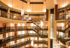
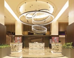
Pursuing Prestige: The Radisson blu water garden
We rarely find a person acquainted with Dhaka who has not heard the name Radisson Blu Dhaka Water Garden or has not seen the iconic pitched roof building on the airport road. For years the name has carried the essence of luxury, exclusivity, and prominence to mass people. Just paying a visit to Radisson is enough to make someone feel special. Since 2006, Radisson Blu Dhaka Water Garden has been a prominent name in the luxury hotel market. The luxury and exclusivity with a touch of nature make it the perfect blend for people who want to experience proper five-star hospitality in Dhaka. Radisson Blu Dhaka Water Garden is between the city center and the airport area, making it easy to locate and access, especially for international travelers, including most of the target group. Being situated away from the urban chaos gives it a spacious room to breathe, making it worth battling through the Dhaka traffic to spend quality time with the city dwellers. The building stands as an icon of a five-star hotel in Dhaka city amidst water bodies and green landscapes. The whole area comprises 7-acre of land, but the building stands only on 2.5 acres, leaving the rest to embrace the natural landscape. It becomes hard to miss due to the fusion of Modernist architecture with the nostalgia of our traditional pitched roof. The project is a partnership between the property owner, Sena Hotel Developments Limited, and the multinational corporation, Radisson Hotel Chains, which provides quality management. International and local consultants worked together to develop the building by the brand criteria. Every element, from service, food, room amenities, comfort, building materials, and local experience to security and safety, is carefully designed to provide guests with a meaningful and unforgettable experience. The grand ramped driveway is one of its kind in this hotel. It is rare to find such a spacious approach in Dhaka due to the congestion and scarcity of land. One can see the unhindered view of the cityscape of Dhaka from the drop-off area, overlooking the wide airport road. After a careful security check, the ceiling height change to the lounge is awestriking. This open salon is visible from all floors above. Its height has been scaled down to human proportions by chandeliers of various sizes and height levels, which creates a more inviting atmosphere. The visual drama of the lounge and its modernist design, circular shape, and strategically placed features give the space an impressive appearance. It provides an interactive space for both the visitors and the occupants. The main entrance is from the first floor, and all the public functions comprise the ground floor and first floor, making it easily accessible without any contact with lift buttons or door handles- which proved to be highly useful during the Covid-19 situation. Radisson Blu Dhaka Water Garden, is one of the prominent names in arranging national and international high official Government and private events, particularly in terms of its security and hospitality. They offer versatile conference rooms that can accommodate up to 1,100 attendees, ensuring the success of events of all sizes covering approximately 3,000 square meters. The Grand Ballroom’s 990 square meters can accommodate a memorable wedding celebration or buffet. The Utshab Banquet Hall is available for product-launching-style events. Several boardrooms are also accessible for personal meetings, training courses, breakout sessions, and other smaller events. Healthy food over taste is a primary priority at Radisson Blu Dhaka Water Garden. The four restaurants and one bar named Blaze Entertainment Lounge & Bar, try to maintain the international standard in every dish. One can enjoy fresh, wholesome Bangladeshi cuisine at ‘Sublime’- a restaurant perfect for a romantic evening or an important client meeting. ‘The Water Garden Brasserie’ can be a perfect option for breakfast, lunch, or dinner, and choose from the international buffet and cook-to-order stations. ‘Spice & Rice’ offers a contemporary twist on Asian food, and ‘Chit Chat’, a deli café, can satisfy the cravings for savory snacks and sweet treats. They also have a dedicated space for smoking called ‘the Cigar bar’. The hotel business is going through a period of transition. The market has been divided into subsets to cater to a wide range of potential clients. Radisson Blu Dhaka Water Garden strives to appeal to locals and tourists by incorporating local cultural elements into its decor and the standard they promise. Radisson Blu Dhaka Water Garden offers accommodation services with its 200 five-star standard hotel rooms and suites. All the rooms have a balcony that offers stunning views of the hotel’s pool, rich landscape, and bustling city streets. In addition, they offer non-smoking floor services for the convenience of their customers. A significant feature of this hotel is the abundance of positive natural light seen throughout. At different times of the day, the play of light and shadow produces contrasting yet complementary effects. The garden, pool, and pond create sublime atmospheric peace. The pond area’s natural splendor lies in the fact that it has been preserved in its original setting, thus enhancing the genuineness and significance of the overall experience. The significance of this pond is enhanced by the jogging path that circles it. The open lounge area next to the pool, surrounded by organized nature, is a beautiful spot to spend some quiet time in the fresh air. The entire garden is planned such that there are always blooms to be seen, no matter the time of year. Radisson Blu Dhaka Water Garden, tries to encourage energy conservation and an eco-friendly environment. They reduce water waste by rainwater harvesting. The hotel promotes low and efficient water and electricity use by creating awareness whenever possible. They utilize as much natural light as possible indoors, given that most of the space is outdoors. The day light-sensitive technology used in light fixtures ensures minimal or no waste of energy. Radisson Blu Dhaka Water Garden promises to provide the best when it comes to service. However, finding skilled human resources who can meet the
Read More
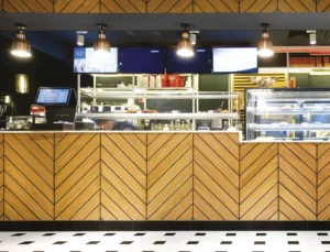
Freshly Baked Paris In The Heart Of Dhaka- Delifrance
Almost everyone who watched Western movies felt compelled to sample the aroma and atmosphere of a Frenchstyle bakery. Del france in Dhaka is the right place to get tapped on that subconscious note. Abid Mansur, Managing Director, Les Bleus Ltd., and the conveyor of Delifrance in Bangladesh, has been enticed by the healthcare and wellness sector as a squash enthusiast, but by the influence of memories, filling the gap of a perfect French bakery in town happened. The basic rule of the house is to make room for a improvements every day. The previous airline business of the family was a good help with the catering services taken as experience. Yet restaurant is not just about food but the experience of service and ambiance. Athula Priyankara, the CEO, leads a team that provides promised services. The ultimate happiness of customers is what their motto has been; that is what brings them back. Delifrance’s baked items are made with flour from the Grands Moulins de Paris, a major French milling company operating since 1919. The recipes served follow the franchise standards, and the new recipes also get approved by Paris. Hence, the international-quality chefs bring to the table a range of savoury dishes alongside croissants and other finger foods. The requirements and interior designing instructions came from a European interior design company, followed and designed by a local architectural consulting company, Chinton Architects Ltd. Starting from the colcur codes to the variation of sitting arrangements, the company has been under international protocols of the franchise. The play of experiences within the space has been the main focus and desire. Neeman Karim and Md. Ishak Mia and their team had previous experience designing for international companies, which eventually helped them implement the work gracefully. A very chic yet welcoming environment, defined by the themed colour palette consisting of bright orange and shades of blue, looks prominent. The basic layout provided by the European company had been well fitted and adjusted within the space. The materials are sourced locally and customised to the desired details, making the process sustainable. The segmentation and zoning of the restaurant are very noticeable and organised with the variation of chairs, lighting and flooring. “Our lifestyle is mostly oriented around fast food and visiting” The walls have intricate details, different textures, paneling, and branding posters. Ceramic tiles were cut and customised on the floor to achieve the desired effect. The ambient light has also been curated with a variation of pendant lighting and contemporary chandelier styles. The lingering aroma of the buttery delights, the buzz of the youthful city crowd, and the everlasting French discernment combine to create a packaged affair that anyone walking past Gulshan Avenue would relish. Authored by Rehnuma Tasnim Sheefa
Read More
Prologue to Paerns Emerald Bakery and Cafe
As muffled conversations and. farewell notes of jazz float up to the sky – the baker gets to work. The bassline and flour have charted a path; the stage has been set. Somewhere in the throes of dawn, the musician and baker find harmony. Lost in their fundamental desire to put together ingredients that make magic; they make something anew. The aroma of bread and notes of the accordion dance together; inspiring and emulating. Food and music universal languages that speak to us all. While crossing the busy street of Banani 11 in Dhaka city, you can randomly walk into the recently launched Emerald Bakery and Café. Owned by the family behind Emerald Restaurants, the Emerald Bakery started its journey with a small shop in Uttara back in 2018. It was initiated by Shamima Rahman with her dream of stepping into the bakery market, and moved to a bigger space within the food court at Chef’s Table in Gulshan. But overall Emerald Restaurants is co-owned by Shamima Rahman (mother), Aminur Rahman (father), Shaker Ibne Amin, Sabbir Ibne Amin and Ayeman Ibne Amin (sons). Shaker Ibne Amin found a gem of a location; one of the very few independent houses left that can be used commercially. This opportunity encouraged them to dream of a street-side venture, not confined within a tall structure made of steel, glass, and concrete. Hence with this new thought process, the Emerald Bakery and Café went through a rebranding. The new branding has a core value of using patterns, as suggested by Prianka Ameen, who worked along with the designing firm, Inked Studio, to wrap this concept throughout the whole café and packaging. “Bakery is science, where measurement is the key and patterns are very mathematical by nature. However, we also wanted to make our place cozy and homely, creating an ambiance that one experiences in a family-run bistro. Therefore, perfectly made patterns would be too rigid and organised for us. Therefore, we decided to go with handmade/drawn patterns, where each motif is flawed yet unique. We have taken this concept to drive the whole design process; from branding and our menu to the architecture,” Sabbir Ibne Amin said while explaining his wife’s concept. Before intervening with the venture in a new location they surveyed and studied a lot of human behaviour. That is mostly how Inked Studio works, being a human-centered design studio. Hence, they tried to build a place where one can work individually, plan office meetings, hang out with office colleagues or friends, have family dinners, or just spend a lazy afternoon with a book. These use cases helped generate the design, the seating layouts, lighting, and sound panels, and Parisian-influenced subtle and muted colour palettes, mostly inspired by nature and the colours from their dishes. Patterns have been made on feature walls using simple and rudimentary techniques. Blocks used for drawing patterns on the f loor have been repurposed to see thru panels that separate open spaces. There is a conscious repetition of elements but in a very organic and uneven way. The paintings of different sizes have been printed and framed first before deciding which walls they belonged to, just as the way one buys paintings for our homes. Mostly the paintings chosen are of classic female painters, although famous among art enthusiasts, are not fairly represented to the masses as opposed to their male contemporaries. Therefore, about half the paintings are works of female artists such as Tamara de Lempicka, Irma Stern, Emily Carr, and Suzanne Valadon. Prianka Ameen, the food consultant for Emerald Bakery, worked closely with Mr Ayeman and the chefs to design and develop the menu. As the cafe business is competitive where they have established The Grove Bistro, Gusto, and Trouvaille, Ms Prianka was tasked with designing a menu that could differentiate “us”. “Studying European and North American cafes and bistros, we came up with our very own twist of a concise, healthy, and diverse menu. Our dishes reflect the comfort and homeliness while strengthening the identity of being both a cafe and bakery,” Mr Sabbir added. The architectural project was led by Inked Studios, a design firm where team members from different fields and expertise work collaboratively to design, develop and execute ideas. Designers who worked on this project from Inked including Zehra (anthropology and literature), Auhona and Navid (Architecture), Redwan (Hospitality Management and Client Servicing), Nashad (Art and Visual Design), Ayeman (Business Administration and Entrepreneurship), Sabbir (Mathematics and User Centered Design) and Zara (Business Administration). The brand line for the bakery and café is the food that syncs. Every project under Inked Studio and Emerald Restaurants has a concept and story behind it. As the venture grows old, it changes but the core concept always remains the same, just as a human. Authored by Rehnuma Tasnim Sheefa
Read More